To add character to a plain new-build, define your character compass first: pick a clear style, core nonnegotiables, and a lighting plan that highlights texture and form. Build a cohesive color palette with one main hue, a secondary, and a neutral, then layer tactile surfaces—wood, stone, fabrics—in durable finishes. Elevate walls with refined profiles and subtle plaster or lime textures. Add warmth with natural materials, curated lighting, and small vintage accents; you’ll discover techniques that transform spaces—and you’ll uncover more as you continue.
Identify Your Character Compass: Define the Style You Want

Your character compass starts with a clear definition of the style you want. You map a precise brief, translating mood, materials, and proportions into a design language you can test against.
Identify core elements you’ll treat as nonnegotiables—jawlines of wood, matte metals, or sculptural forms—and note how they interact with space, light, and texture.
You pursue artistic layering to build depth: consider how overlays—rug textures, wall finishes, and accoutrements—cohere without clutter.
Define lighting ambiance as a functional companion to aesthetics, outlining warmth, contrast, and focal points that reveal character at different times of day.
Keep a practical checklist to avoid scope creep, and validate decisions against a budget and ongoing usage.
This compass guides cohesive, expressive outcomes.
Choose a Cohesive Color Palette for a Modern Home
With a modern home, start by harmonizing your base tones to ground the space and inform lighting choices.
Then apply accent colors strategically to highlight architectural features and focal points without overwhelming the calm palette.
Keep the palette cohesive across surfaces, materials, and fixtures to guarantee a clean, deliberate flow.
Harmonize With Base Tones
To harmonize with base tones, start by identifying the dominant hues in your exterior and interior finishes, then build a palette that supports those foundations without competing with them. You’ll choose a restrained range—one main color, one secondary, and a neutral anchor—to maintain cohesion across spaces.
Consider undertones in materials: warm woods, cool stone, and matte metals; confirm your chosen hues reflect those subtleties rather than masking them. Test samples under natural and artificial light to observe how textures shift.
Apply your palette consistently to walls, cabinetry, and flooring, favoring low-contrast junctions for a calm rhythm. Incorporate Vintage textiles and Eclectic accessories as deliberate accents, not focal points, to reinforce depth without overwhelming the base tone strategy.
Finalize with a documentation wall of color codes for future updates.
Accent Colors Strategically Applied
Acquiring a cohesive palette for a modern home hinges on intentional accent placement that enhances, rather than competes with, the base tones. You’ll keep the core colors neutral and let selective accents define mood and function.
Choose a restrained palette—one or two primary accent hues with subtle variations—to preserve harmony across spaces. Consider color psychology: blues calm, greens invite freshness, warm terracotta adds comfort; apply these tones in furniture, textiles, and art to guide circulation and focus.
Use contrast strategically—dark accents against light surfaces for grounding, lighter tones against saturated backdrops to elevate details. Integrate accent lighting to amplify chosen colors without overpowering architectural lines.
Apply finishes that reflect natural light, ensuring consistency from day to night while avoiding visual clutter.
Layer Texture to Build Visual Interest
Layering texture in a new-build home adds depth and nuance to a otherwise-flat surface plan. You drive visual interest by pairing surfaces with varying tactile qualities to signal zones and functions.
Start with walls: combine matte, satin, and subtle glare-free sheens to create textural contrast without shouting.
Move to floors: mix materials—polished concrete, engineered wood, and soft carpets—to delineate spaces while maintaining flow.
Introduce tactile layering with furniture upholstery and accessories that contrast both color and texture, such as a leather sofa against a boucle chair or a woven runner on a timber floor.
Balance scale and repetition to avoid busy effects; repeat a restrained palette of textures across rooms.
Keep finishes durable, easy to clean, and aligned with architectural lines for coherence.
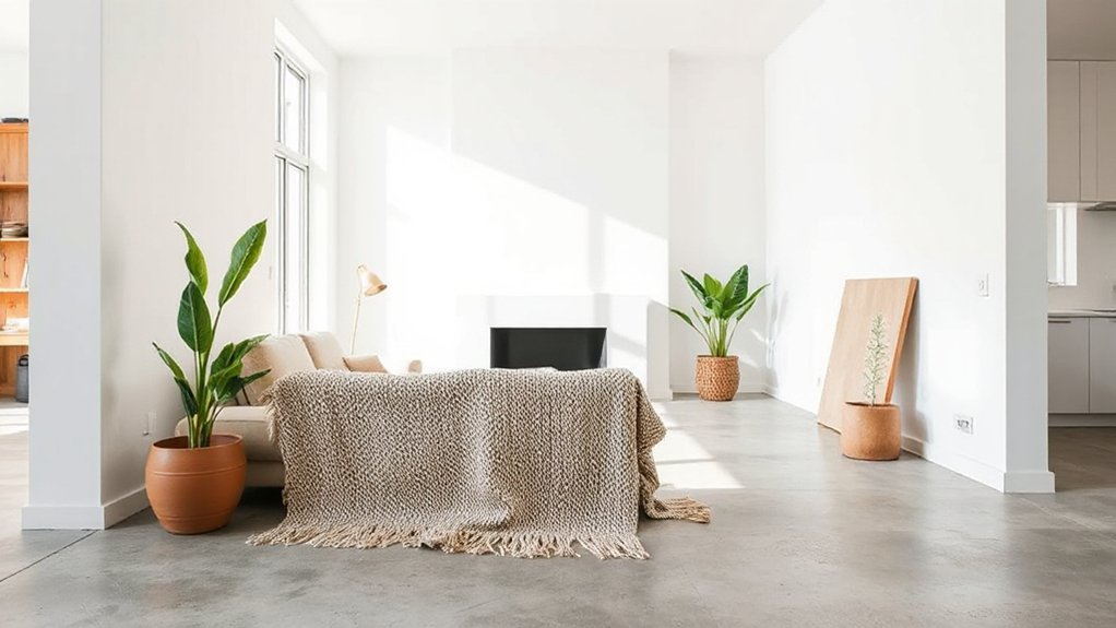
Introduce Warmth With Natural Materials
Natural texture accents introduce tactile warmth, guiding you to select materials that age gracefully and read as architectural detail.
You’ll evaluate grain, weight, and finish to balance durability with comfort, pairing wood, stone, or cork with your core palette.
This practical focus sets the stage for cohesive warmth throughout the home.
Natural Texture Accents
When you introduce natural texture accents, you bring warmth and tactility to a new-build with materials that age gracefully and feel instantly inviting. You pair textures with a restrained color palette to maintain clarity and coherence, ensuring the space reads intentional rather than fussy.
Focus on surfaces that wear well, like flax linen, unglazed ceramic, or sawn timber, choosing finishes that emphasize grain and character. Incorporate Vintage accents and Urban influences through thoughtfully scaled pieces that don’t overwhelm architectural lines.
Strategic layering of textiles, wall cladding, and cabinetry creates depth without bulk. Maintain balance by aligning tactile elements with light, shadow, and proportion, so the material truth remains legible.
In this way, texture acts as a durable, sensorial framework for daily living.
Warmth Through Materials
Texture isn’t just about appearance—it’s a strategic tool for warmth. You’ll harness natural materials to modulate light, color, and tactile experience, guiding mood with precision.
- Prefer warm-toned woods and textured stone to build a tactile base that reads as cozy.
- Use textiles with earthy fibers and subtle sheen to soak up and reflect glow.
- Apply color theory principles—verticals in deeper hues paired with lighter ceilings to enhance perceived warmth.
- Integrate varied finishes and strategic lighting techniques to sculpt depth without clutter.
Choose materials that balance porosity and warmth, then align lighting to emphasize grain and color shifts. The result is a coherent, inviting environment where form follows function, reducing visual fatigue while supporting long, comfortable daily living.
Elevate Walls With Subtle Architectural Details
Subtle architectural details can elevate plain walls without overwhelming a space. You’ll shape walls with precise profiles—cove, bead, and casing—so light plays across surfaces without shouting. Use a consistent depth to maintain cohesion, then pair with trim that echoes your room’s proportions.
In a new-build, keep joints clean and paint margins tight to avoid shadow lines that feel unfinished. Introduce texture with plaster or lime finishes in restrained tones, letting natural light reveal depth.
For a refined look, layer visual interest through color contrast in adjoining millwork rather than on every surface. Consider Vintage textiles or Eclectic accessories to accent corners softly, ensuring the wall treatments remain the quiet backbone.
This approach preserves airiness while enhancing character.
Make Lighting Your Character Moment

Lighting should become your character moment by drawing attention to the room’s best angles and textures. You’ll shape atmosphere with precision, balancing function and mood while preserving architecture.
Use layered lighting to sculpt shadows, highlight materials, and guide movement. Employ vintage accents and eclectic textiles to add depth without clutter.
Focus on three core layers: ambient, task, and accent, ensuring each is dimmable for versatility. Tailor color temperature to the space, favoring warm tones for comfort and cool tones for clarity.
- Position wall sconces to frame art and architectural features.
- Install track or recessed lighting to emphasize focal textures.
- Add table lamps with characterful bases for scale and intimacy.
- Integrate accent lighting to spotlight vintage accents and eclectic textiles.
Add Pattern Without Clashing Styles
Pattern harmony guides you to pair prints with complementary scales and motifs, so you keep cohesion without boring repetition. Start with a unifying element—color, texture, or line—to anchor varied patterns and prevent clashes.
With Clash-Free Pairings in mind, you’ll balance bold and subtle choices by aligning pattern weight and spacing to the room’s architectural rhythm.
Pattern Harmony Rules
To add a pattern without clashing across a new-build home, start by establishing a unifying base—neutral tones, consistent scale, and a cohesive material palette—and then layer in one or two motifs that echo that foundation.
- Select a primary motif grounded in the base palette, ensuring its scale remains calm and legible.
- Introduce a secondary motif with subtle contrast to create texture rather than spectacle.
- Maintain consistent cadence across rooms by repeating the same visual rhythm in textiles, wallpaper, and surfaces.
- Use vintage patterns sparingly, balancing them with modern elements to preserve timeless clarity and textural contrasts.
Clash-Free Pairings
Prioritize scale and rhythm: alternate large motifs with smaller repeats to avoid visual overload. Use contrast sparingly, ensuring edges and surfaces remain readable.
When mixing patterns, align them through shared undertones, textures, or metallic accents to create a coherent flow. Test each pairing in different lighting and rooms to confirm consistency.
Include vintage accents as focal points and weave eclectic accessories into transitional zones, so character feels deliberate, not accidental. This approach delivers depth without clutter, balancing function, style, and longevity.
Curate Furniture for Character and Practicality
How you curate furniture for character and practicality starts with a clear plan: choose pieces that tell a story yet serve daily routines without fuss.
- Select furnishing essentials that balance form and function, emphasizing durability and scale.
- Map spatial arrangements to maintain flow, ensuring sightlines and easy access between zones.
- Prioritize multiuse pieces—sofas with storage, tables that double as desks, adjustable lighting for different tasks.
- Align finishes and textures to echo architectural materials, weaving cohesion without monotony.
This approach keeps rooms legible and purposeful while adding personality. You’ll achieve a collected look through measured contrasts, not clutter.
Maintain consistency in silhouette and proportion, then layer with restrained accents. The result blends technical precision with aesthetic restraint, delivering spaces that feel curated yet lived-in.
Personalize Without Clutter: Subtle Home Accessories
Subtle ornament curation lets you express personality without clutter, selecting pieces that echo your routine and space. You’ll place accessories strategically to balance focal points with negative space, avoiding visual overload.
Favor minimalist decor longevity by choosing durable materials and timeless silhouettes that age gracefully while preserving a cohesive, functional aesthetic.
Subtle Ornament Curation
To achieve a refined look without clutter, curate small, meaningful ornaments that reinforce the home’s color palette and material language. You’ll choose pieces with tactile texture, restrained scale, and purposeful placement to avoid visual noise.
- Select vintage accents that echo your woods and brass tones, creating a quiet timeline within rooms.
- Pair eclectic accessories with simple lines to avoid competing shapes.
- Group three items at focal points to form intentional vignettes rather than scattered clutter.
- Rotate seasonal pieces briefly, then return to a core quartet to maintain consistency.
Keep finishes matte or lightly satin, and position objects at eye level for legibility. The result feels curated, not curated-over. Subtle ornamentation supports architecture while hinting at personality through vintage accents and eclectic accessories.
Strategic Accessory Placement
Place a single vintage finds piece where it anchors the eye, avoiding overpowering the layout. Pair it with controlled repeats of color and material to maintain rhythm rather than chaos.
Opt for statement textiles to define zones—think a bold throw on a sofa or a patterned rug under a dining table—yet keep surrounding surfaces clear to preserve flow.
Rotate or swap pieces seasonally to refresh mood without accumulating clutter.
Prioritize scale and proportion: small rooms gain impact from careful, deliberate choices rather than abundance.
Document placements to guide future rearrangements.
Minimalist Decor Longevity
Small, well-chosen accessories can age gracefully with your home, adding personality without inviting clutter. Minimalist decor longevity hinges on restraint, material quality, and purposeful placement that reads as intentional rather than decorative overload. You’ll balance function with texture, ensuring each piece earns its keep.
Use vintage accents and eclectic accessories sparingly to avoid dissonance, letting them serve as quiet anchors in a modular space. Focus on tones, silhouettes, and tactile finishes that weather well over time. Maintain a neutral base and let small contrasts tell the story.
- Curated tray with heirloom-like forms
- Subtle ceramic or glass vessels in muted hues
- A single, well-made lamp that emphasizes shadow
- A low-profile, textural textile accent
These choices cultivate longevity without clutter.
Windows That Speak: Characterful Treatments

Windows can define a home’s character by combining frame, glass, and treatment choices that reveal light, proportion, and craft. You’ll select profiles that balance structural clarity with tactile warmth, prioritizing fit to the wall plane and daylight behavior.
Choose frames in materials that resonate with your overall palette—timber for warmth, aluminum for precision, or composite for durability. Glass choices matter: low-E coatings reduce glare, while clear panes maximize transparency and view.
Treatments should be understated yet expressive: slim mullions, integrated blinds, or soft shading devices that don’t overwhelm the line of the window. This approach enables vintage furniture harmonies and eclectic accessories to read as intentional accents, not afterthoughts.
The result: refined character through practical, repeatable detailing rather than stylistic extremes.
Ground Your Space With Varied Heights and Proportions
Varied heights and proportions ground a space by orchestrating how you perceive its scale and movement. You actively shape rhythm through ceiling line choices, furniture heights, and architectural details that guide eye travel and occupancy comfort. Use measured variety to avoid flatness while preserving cohesion.
Consider practical cues:
1) Elevation shifts at key zones, like foyers and living areas, to create visual landmarks.
2) Ceiling variance, from tray to coffered, to establish hierarchy without clutter.
3) Window placements and treatment heights that frame light and balance mass.
4) Proportion checks between furniture, fixtures, and architectural accents for integrated flow.
Foyer lighting should announce entry with proportionate glow, while window treatments control mass perception and exterior rhythm.
Build an Artwork and Decor Library for Character
You start by building an artwork library and curating a decor archive that align with your home’s rhythm and lighting.
Keep the collection focused on coherence, scale, and material variety to support a cohesive narrative.
Use this library as a practical reference to guide purchases, rotations, and emphasis in every room.
Build an Artwork Library
A well-curated artwork library adds immediate character to a new-build home by aligning pieces with your space, lighting, and tactile goals. You’ll structure a cohesive set that strengthens scale, texture, and mood, ensuring each piece supports daily use and long-term harmony. Build around a core trio: focal statement, supporting accents, and a rotating mini-gallery to refresh energy without clutter.
1) Establish a neutral backdrop with warm neutrals to let vintage motifs pop without competing with architectural lines.
2) Group related works in varying sizes to create depth, rhythm, and a sense of intentional progression.
3) Mix media and finishes—oil, print, metal, canvas—to introduce tactile contrast and Industrial accents.
4) Schedule predictable rotation moments to preserve focus, reduce damage risk, and sustain curiosity.
Curate a Decor Archive
Photograph items front and back, note light exposure and seasonal relevance, and map access points for daily rituals. Maintain provenance notes for meaningful purchases and restorations, linking Vintage accents to their stories for cohesion.
Prioritize a flexible framework: modular displays, rotation, and express storage for seldom-used pieces. Integrate Eclectic accessories as punctuation, not clutter—curate crossings of period and texture.
Review quarterly, prune redundancies, and document evolving taste to sustain character over time.
Create Distinct Nooks While Maintaining Flow
Creating distinct nooks without breaking floor plan flow requires deliberate placement, scale, and lighting. You’ll carve character by framing zones with built-ins, color, and furniture size that respects sightlines. Aim for harmonious passages rather than rigid dividers.
- Position seating and shelves to cue purpose without obstructing pathways.
- Align color and texture with adjacent spaces to fuse rather than fence off.
- Use lighting levels to shift mood between zones.
- Introduce vintage accents and eclectic mix through small, curated focal pieces.
Incorporate subtle architectural cues—window seats, half-walls, or a console—to define a reading nook, coffee corner, or display alcove. This keeps flow intact while offering intentional, intimate moments within a broad, cohesive home aesthetic.
Use Rugs to Define Character Zones

Rugs anchor each character zone by defining boundaries and infusing texture, color, and warmth underfoot. You’ll use size, pile, and pattern to signal purpose—living, dining, workspace—without adding walls.
Choose flatweave or low-pile options for high-traffic areas, and plush textures where comfort matters. Layer with tone-on-tone hues to preserve rhythm, or introduce bold motifs to create focal points.
Vintage textiles can bring history and patina, enriching a modern skeleton with character while staying practical. Keep underfoot materials consistent with room function, and avoid overly busy patterns that clash with upholstery.
Pair rugs with statement lighting to emphasize zones; guarantee light sources highlight texture without glare. Finally, consider underlay for stability and longevity to maintain defined, durable boundaries over time.
Refresh Hardware and Finishes With Purpose
Refresh hardware and finishes with a clear intent: each choice should reinforce the home’s character while serving daily use. You’ll balance durability with design by pairing materials and fixtures that age well and feel intentional.
- Hardware mood boards: select knobs and pulls that echo vintage accents while maintaining modern ergonomics.
- Finish harmony: blend matte blacks, warm brass, and patinaed metals to create eclectic mixes without visual chaos.
- Door and drawer thresholds: choose robust, low-profile options that glide smoothly and look refined.
- Surface tactility: opt for stone, timber, or composite with a consistent grain or veining to unify spaces.
Done deliberately, every touchpoint reads cohesive, inviting, and purposeful.
Small Kitchen Edits That Characterize the Space
Small kitchen edits can define the space without major overhauls. You can steer the tone with precise, scalable tweaks that feel intentional rather than cosmetic.
Start by selecting durable, easy-to-clean surfaces and keep lines clean to preserve the look of a new-build.
Introduce vintage accents through small, well-placed pieces—an enamel mug rack, a retro timer, or copper-dipped handles—that nod to character without dated kitsch.
Pair these with statement fixtures, such as a bold pendant or a sculptural faucet, to anchor the room visually.
Prioritize consistent metal finishes and controlled color accents to avoid clutter.
Use functional organizers to maximize storage, ensuring every edit enhances both usability and aesthetics.
Test the layout by rotating items until workflow remains efficient.
Budget Bathroom Upgrades for Character

If you’re renovating on a budget, focus on high-impact, cost-efficient moves that elevate the space without a full remodel. Strategic choices in fixtures, finishes, and storage can deliver a polished, cohesive look. Prioritize tactile materials and smart placement for immediate character without overhauls.
- Swap faucet and hardware to brushed nickel or matte black to define the vibe.
- Install a backlit vanity mirror and open shelving for depth and function.
- Update tiles with a small, bold pattern or color accent while keeping grout light.
- Add greenery and a compact planter niche, pairing garden landscaping cues with tidy storage.
Incorporate smart home technology for lighting scenes and efficiency, while pairing durable finishes with a clean, cohesive aesthetic.
Extend Character to the Outdoors: Exterior Coherence
Exterior coherence starts with a unified material and color scheme that ties the home’s façade to its interior finishes. You select finishes that repeat or complement exterior cladding, trim, and window surrounds, creating a seamless reading from inside to out.
Choose proportionate scale for doors, overhangs, and railings to reflect interior lineage. Extend this logic to landscape elements: garden pathways should mirror interior floor tones and textures, guiding movement without competing with architecture.
Use outdoor lighting to reinforce form, casting restrained shadows that reveal architectural details after dusk. Plan the distribution of plantings so they frame views rather than obstruct access, ensuring the exterior reads as an intentional extension.
This coherence elevates curb appeal and enhances daily use without requiring drastic changes later.
Maintenance-First Upgrades That Endure
- Durable surfaces and finishes that resist wear
- Efficient insulation, sealing, and moisture management
- Energy‑savvy systems with scalable automation
- Materials and hardware chosen for timeless appeal
You’ll feel the difference in comfort, cost savings, and a cleaner aesthetic that ages gracefully.
Frequently Asked Questions
How Can I Avoid Over-Personalizing a New-Build?
To avoid over-personalizing, you’ll prioritize flexible, timeless ideas. Focus on scalable, neutral foundations and modular accents. Personalization tips stay lightweight, while future proof design emphasizes adaptable layouts, durable materials, and tech-ready infrastructure for evolving tastes and needs.
Which Features Quickly Convey Character Without Clutter?
You’ll instantly spot character with unique fixtures and vintage accents; they frame space like punctuation in a sentence. You choose practical details, balancing aesthetics and function, ensuring the tech stays clean while the charm remains unmistakable and deliberate.
What Budget-Friendly Details Make a Modern Home Feel Lived-In?
You can elevate a modern home with personalization tips and budget friendly accents that feel intentional. You’ll mix materials, add art, and layered textures, while measured lighting and hardware updates stay practical, technical, and aesthetically cohesive throughout the space.
How to Balance Character With Resale Value Considerations?
Is balance possible between character and resale value? You prioritize custom paint and unique fixtures, ensuring thoughtful color schemes and durable selections, while maintaining broad appeal. You, applying a measured blend, protect long-term value without sacrificing distinctiveness.
Which Elements Should I Upgrade First for Lasting Impact?
Prioritize architectural details like crown moldings, trim, and durable fixtures, then pick timeless color schemes. You’ll gain lasting impact by upgrading focal elements first, balancing practicality with aesthetics while preserving resale value.
Conclusion
You can craft character with clarity and core choices. Start by syncing your style compass, then blend color, texture, and warmth into every corner. Layer architectural tweaks, trim walls, and tailor tiny kitchen and budget baths to tell your story. Extend that voice outdoors, ensuring exterior coherence, and pick maintenance-smart upgrades that endure. Practicality meets aesthetics as you weave warmth, weight, and whimsy into the plain, making your new-build feel uniquely yours. Bold, balanced, beautifully cohesive.