Sage green and grey create a calm, modern bedroom palette with restrained contrast and layered textures. Choose a look—calming, modern, or cozy—and test swatches under natural and incandescent light to gauge depth. Pair medium to dark greens with cool greys for dimension, softening with warmer greys to add warmth. Layer fabrics like brushed cotton, linen blends, and wool in low-sheen finishes, and use a single botanical accent for focus. If you keep exploring, you’ll uncover practical styling steps and tips.
Define Your Look: Calming, Modern, or Cozy Sage Green and Grey
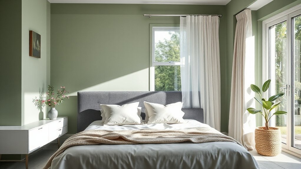
Calm, modern, or cozy—the look you choose defines your space. You specify a mood, then translate it into form: color, texture, and scale.
For calming, favor restrained contrasts, soft sage with warm grey undertones, and low-sheen paint finishes to reduce glare. You’ll choose bedroom furniture with clean lines and ample negative space to sustain serenity.
In a modern setup, you balance geometric silhouettes, metal accents, and high-contrast pairings; opt for high-contrast paint finishes and minimalist hardware.
Cozy atmospheres rely on tactile fabrics, wood warmth, and subtle layering; select rounded edges and plush textiles.
Whichever path you pick, document a consistent palette, test swatches, and align furniture placement with traffic flow to optimize function and comfort.
Sage Green and Grey Undertones: Choosing Depth and Temperature
Sage green and grey undertones shape depth and temperature by balancing hue, saturation, and luminance. You calibrate depth by leaning between medium and dark greens with cool greys, avoiding high-chroma contrasts that flatten rooms.
Temperature shifts come from base undertones: warmer greys soften sage; cooler greys sharpen it. You measure lightness ranges using a controlled luminance ladder to prevent muddy tones after time-of-day changes.
For artistic inspiration, you’re advised to test swatches under natural daylight and incandescent glow to verify perceived depth and emotion.
Historical influences guide your palette choices: muted, soil-inspired greens echo vintage interiors, while ash or dove greys reference midcentury modern restraint.
Precision selection minimizes saturation spill, ensuring the undertones support focal art and architectural details without competing with them.
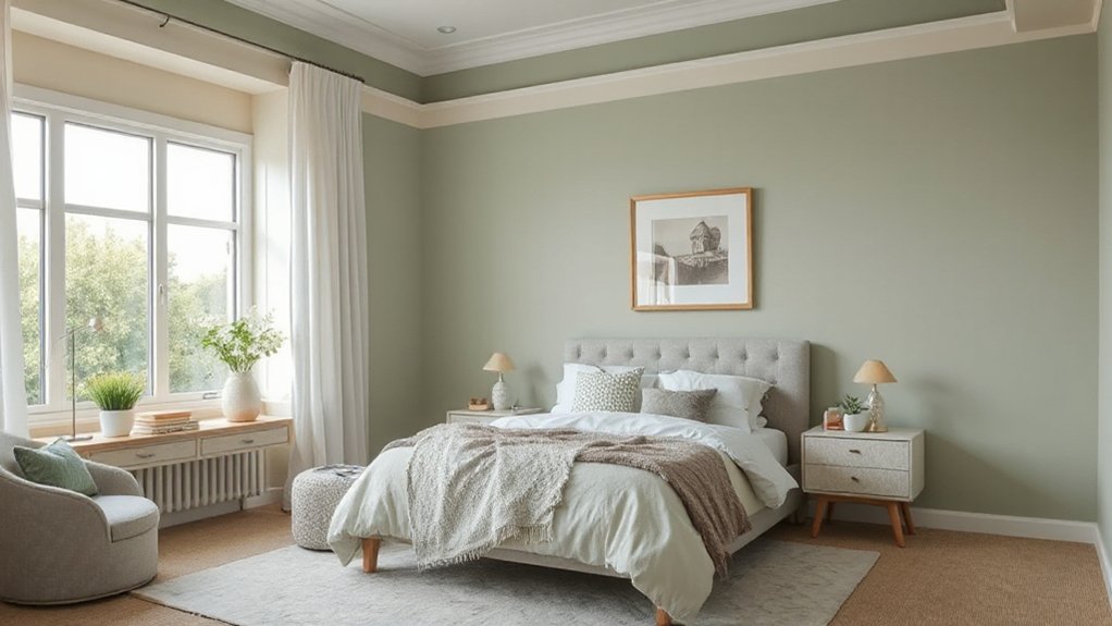
Layer Textures for Cozy, Modern Calm
Layering textures helps you sustain a cozy, modern calm without visual clutter. You’ll balance hierarchy and tactility through deliberate textural layering, not excess decoration.
Start with a solid foundation: choose neutral, low-sheen fabrics for bedding to minimize glare while preserving depth. Introduce contrast via subtle patterning or weave variation in rugs and throws, keeping color consistent with sage green and grey undertones.
Fabric choices matter: opt for brushed cotton, linen blends, and wool blends that drape, compress, and breathe. Place a weighted throw at the foot and layer multiple pillow sizes to create dimension without visual noise.
Keep the palette cohesive by repeating the same fiber families across accoutrements. This approach yields calm, modern warmth while preserving a streamlined, uncluttered feel.
Lighting Sage: How Light Elevates Sage Green and Grey
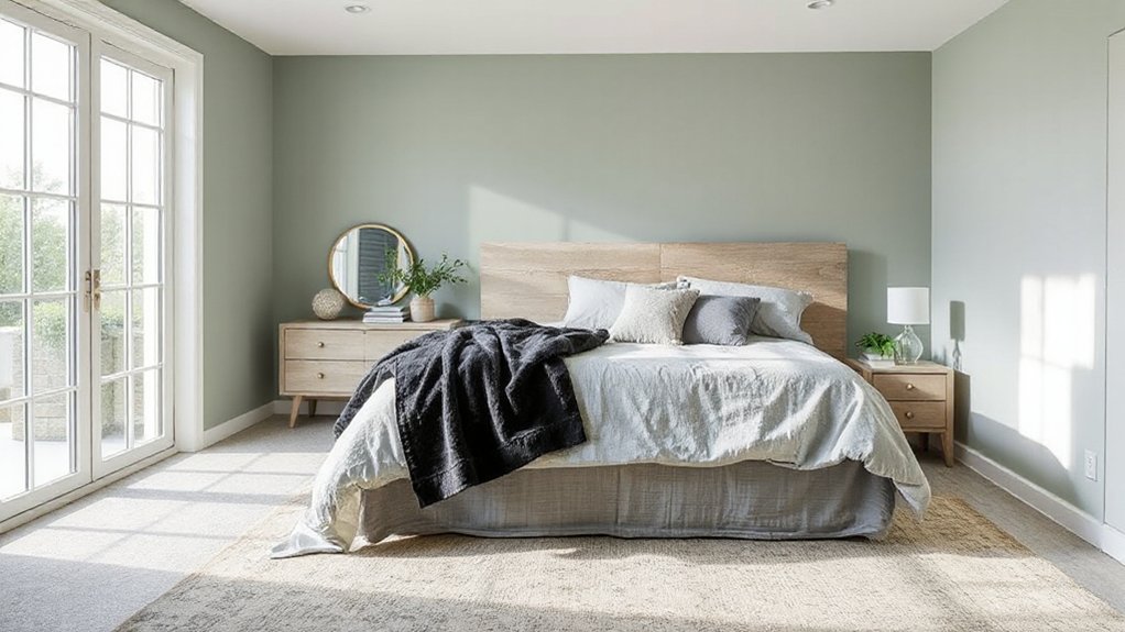
How does lighting transform sage green and grey in a bedroom? You evaluate lighting as a design tool, not decor fluff. Lighting techniques shape hue perception, contrast, and mood, confirming sage’s cool balance with grey’s neutrality.
Ambient light should stay soft and even to preserve the palette’s serenity; use fixtures with high CRI to render accurate greens. Task lighting highlights architecture and textures without overpowering the color story.
Consider daylight first: natural vs. artificial sources create dynamic shifts throughout the day, so plan for layering to keep consistency.
For artificial options, opt for warm to neutral white tones for warmth without yellowing sage, or cooler whites to emphasize modern grey. Dimmers provide control, ensuring the light level matches activity and time.
Pairings by Mood: Sage Green and Grey With Accessories and Accents
You’ll explore accessorizing with charm to elevate sage green and grey palettes, keeping textures and finishes purposeful. This mood-driven guide spots accent colors and how they harmonize with the base tones, ensuring a cohesive look.
Use deliberate pairings to highlight room personalities while maintaining balance and visual clarity.
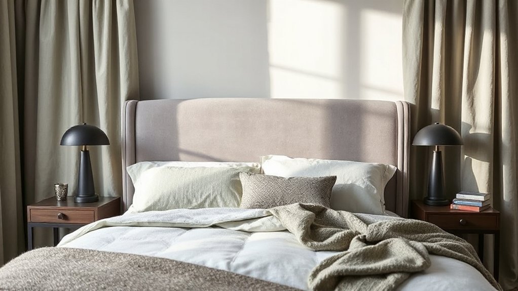
Accessorize With Charm
Pair sage green and grey with thoughtfully chosen accessories to reinforce a calm, cohesive mood. Start with botanical prints to echo natural calm and keep overall balance. Use subtle metallic accents for a touch of refinement without overpowering the palette.
Opt for a restrained mix of textures—linen, wool, and cotton—to preserve tactile interest while maintaining serenity. Choose a single statement item, such as a framed botanical print or a ceramic vase, to anchor the scene.
Layer small, repeating accessories—pillow covers, throws, or lampshades—in sage and grey variants to reinforce continuity. Avoid busy patterns that disrupt cohesion.
Guarantee hardware and hardware finishes align: brushed nickel or muted brass complements. Maintain a clear focal point, limit color pops, and preserve a clean, purposeful aesthetic throughout the space.
Mood-Driven Pairings Guide
Sage green and grey establish a calm, versatile foundation for mood-driven pairings, guiding how accessories and accents set the room’s tone. You’ll tune mood with controlled contrast, texture, and material logic rather than color splash.
Begin with a neutral base, then layer purposeful accents that reinforce intent: low-contrast textiles for serenity, higher-contrast metals for focus, and tactile finishes to cue warmth or coolness. When selecting artificial lighting, prioritize daylight-mimicking LEDs to preserve true sage and grey hues, and vary intensity to modulate atmosphere without color shift.
Consider paint finishes as a microtool: matte for quiet backdrops, satin for subtle sheen, and semi-gloss only where directional light highlights features. Align accessories with these planes—art, storage, and decorative objects—so mood remains cohesive through scale, texture, and placement.
Accent Colors Spotlight
How do you leverage accent colors to sharpen mood in sage-green and grey rooms? You pair accents with purpose, aligning hue, saturation, and contrast to reinforce color psychology.
In this scheme, choose accessories that echo sage or cool greys, then introduce a deliberate pop—never random. Artificial lighting matters: warm LEDs soften sage, cool LEDs sharpen grey, altering perceived mood.
Use metallic accents (brushed brass or satin nickel) to add sophistication without clutter. Textural cues—linen throws, wool rugs, or velvet cushions—create depth that supports the main palette.
For mood-focused accents, limit the chroma to two to three standout items and coordinate their luminance. Maintain balance by distributing accents across furniture, textiles, and artwork, ensuring visual harmony and a cohesive, purposeful interior.
From Walls to Accessories: Practical Application Guide
To translate color choices from concept to room, start with a practical plan that maps wall tones to key accessories and finishes. You’ll align sage green and grey foundations with a restrained palette, then layer texture through materials and hardware.
Identify the dominant wall color first, then pair it with a complementary second shade for trim or accent walls. Choose bedroom furniture that reinforces the design: solid silhouettes, muted metals, and natural wood with minimal grain to preserve calm.
For window treatments, select fabrics that echo the wall tones and add light control without contrast shocks. Implement metallic or matte finishes on fixtures to maintain cohesion.
Finally, test scale and spacing with swatches and samples in natural light to guarantee balance across surfaces and textiles.
Seasonal Refreshes: Maintenance and Finishing Touches
Seasonal refreshes keep a calm bedroom scheme functioning smoothly by focusing on maintenance and finishing details. You tighten the system by scheduling quick checks of door handles, hinges, and vent covers, ensuring smooth operation and quiet performance.
Inspect surfaces for wear, reseal high-traffic areas, and wipe down finishes to preserve the sage green and grey palette. Align updates with lighting shifts; adjust bulbs to preserve color accuracy in wall decor and furniture finishes.
When updating, choose bedroom furniture and wall decor that reinforce tonal balance rather than overpower it. Clean seasonal textures—linens, rugs, and cushions—in parallel with paint or wallpaper refreshes to prevent color drift.
Document changes, note material compatibility, and maintain a concise upkeep routine for lasting cohesion.
Frequently Asked Questions
How to Choose the Best Sage and Grey Combo for Small Rooms?
Choose sage and grey combos by prioritizing color contrast and lighting techniques; in small rooms, use lighter greys with warm sage accents, maximize natural light, and employ layered lighting to avoid flatness and create perceived depth.
Which Ceiling Color Pairs Well With Sage Green and Grey?
You should pair sage green and grey with a pale, cool ceiling—opt for ceiling paint options like crisp white or light blue. Consider ceiling decoration ideas that emphasize subtle contrast and clean lines for a cohesive look.
What Fabrics Resist Fading in Sage and Grey Palettes?
One statistic: fabrics for durability often last 3–5x longer when treated for fade resistance. You’ll want fading resistant textiles that prioritize UV-stable dyes, frequent washability, and low organic quick-bleed. Choose durable, fade-resistant fabrics for longevity.
Can You Use Bold Art Without Overpowering the Scheme?
Yes, you can; bold art won’t overpower if you balance with ample color contrast and thoughtful scaling. Keep restraint in frames and spacing, let the piece anchor the room, then echo its tones across textiles and decor accents.
How to Balance Sage and Grey in a Rental Space?
You balance sage and grey in a rental by layering neutral upholstery, selecting sustainable paint options for touch-ups, and using a detachable wallpaper accent wall ideas to add depth without committing. Keep finishes low-sheen and cohesive throughout.
Conclusion
Layer your sage green and grey scheme with subtle, noncommittal tweaks that stay in bounds. Embrace gentle contrasts and soft textures to avoid overstatement, and let lighting do the heavy lifting. When in doubt, swap accessories rather than repaint—it’s a low-stakes upgrade. Maintain balance, not pressure, and you’ll enjoy a calm, modern space that quietly adapts as tastes shift. In short: refine, not overhaul, and breathe easy with each thoughtful detail.