Paint often dries darker or lighter depending on pigment mix, base, finish, and how thick you apply it. You’ll see shifts from batch variation, how the coating cures, and even the room’s lighting and surfaces. Expect warmth or cool undertones to shift as the film thickens and as the gloss changes reflectivity. To predict it, test in real room conditions with representative lighting and patches from the same batch. If you keep testing, you’ll master the nuances and outcomes.
Understand Why Paint Dries Darker Or Lighter
Paint often looks darker or lighter as it dries due to changes in film thickness, solvent evaporation, and the chemistry of pigments and binders. You’ll notice this before the paint cures, when the surface height varies and moisture redistributes, subtly shifting light interaction.
Lighting effects play a role in perceived shade, but the underlying cause is material physics, not mood or intent. As solvent leaves, pigment particles pack differently, altering refractive angles and gloss, which changes brightness at the same hue.
You should also consider pigment consistency; batches can differ slightly in particle size and distribution, affecting opacity and color strength during drying. Understanding these factors helps you predict final finish and minimize surprises across surfaces.
How Lighting And The Room Affect The Final Shade
Lighting shifts hue perception, so you’ll notice color readings vary with how bright or warm the room is. The mood of the space also skews shade intent, shaping how the final coat reads under different luminance and reflections.
Expect measurable variance between samples taken in galleries, doorways, and actual living areas as you evaluate the true color outcome.
Lighting’s Impact On Hue
Ambient conditions shape the hue you perceive: the color you see on a wall can shift under different light sources, intensities, and room colors. In practice, lighting drives perceptual color shifts, so you must anticipate how a given fixture’s spectral output interacts with your paint’s pigment and the room’s surroundings.
You’ll notice warmer lamps exaggerate yellow and amber tones, while cool LEDs pull toward blue, altering depth and contrast. Daylight influence varies with time of day and window orientation, making swatches appear differently from morning to evening.
Consider test patches under both artificial and natural light to gauge stability. When evaluating, compare against a neutral reference at similar brightness, and document observed lighting effects to avoid misinterpreting the final shade.
Room Mood And Shade Variance
Room mood shapes how a chosen shade ultimately reads, because the room’s colors, textures, and surfaces reflect and absorb light in unique ways. Your lighting, whether incandescent, LED, or daylight, shifts perceived warmth or coolness, changing subtle undertones.
Ceiling height, floor reflectance, and furniture finishes interact with the paint, producing variance across walls and trim. To anticipate this, assess a sample under representative conditions and compare at different times of day.
Consider paint color psychology when selecting hues to align mood with function. Your paint application techniques—roller vs. brush, cut-in consistency, and ideal drying times—affect final uniformity and sheen, influencing perceived shade.
Document observations, then rely on controlled inspections to validate your chosen color before full-room completion.
How Pigment, Base, And Finish Shape The Dry Color
The pigment, base, and finish collectively determine how the dry color reads on a surface, not just the pigment alone. You’ll see pigment variations shift hue, saturation, and warmth differently across primers and substrates, so don’t chase a single swatch.
The base color influence sets the tonal backbone, affecting how light interacts with particles as solvents evaporate and films cure. A cool base dampens warmth, while a warm base boosts it, altering perceived darkness or brightness even with identical pigment loading.
Finish also matters: flat hides imperfections and reads more evenly, while gloss amplifies reflective contrast, pulling the color toward a sharper end of the spectrum. Understand these levers to predict final shade before you commit.
Test Paint Samples In Real Rooms: A Step-By-Step Method
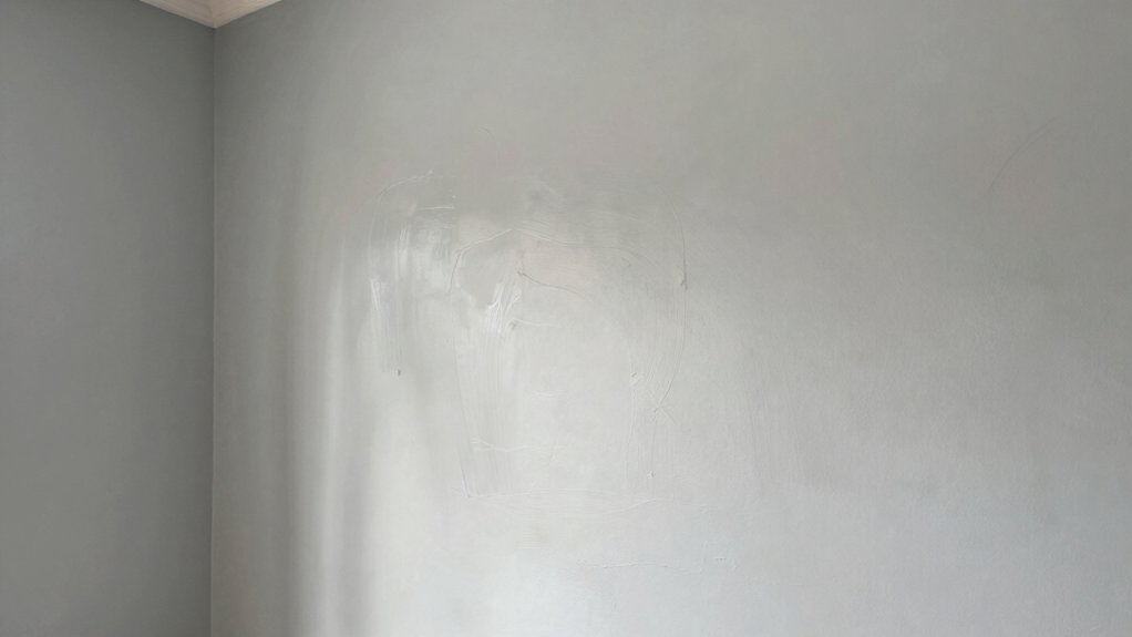
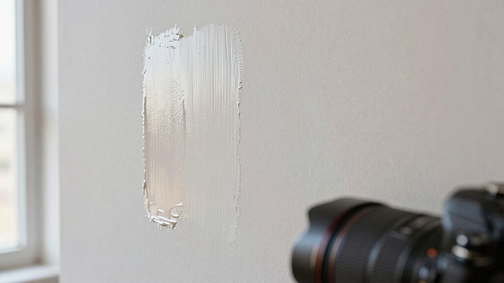
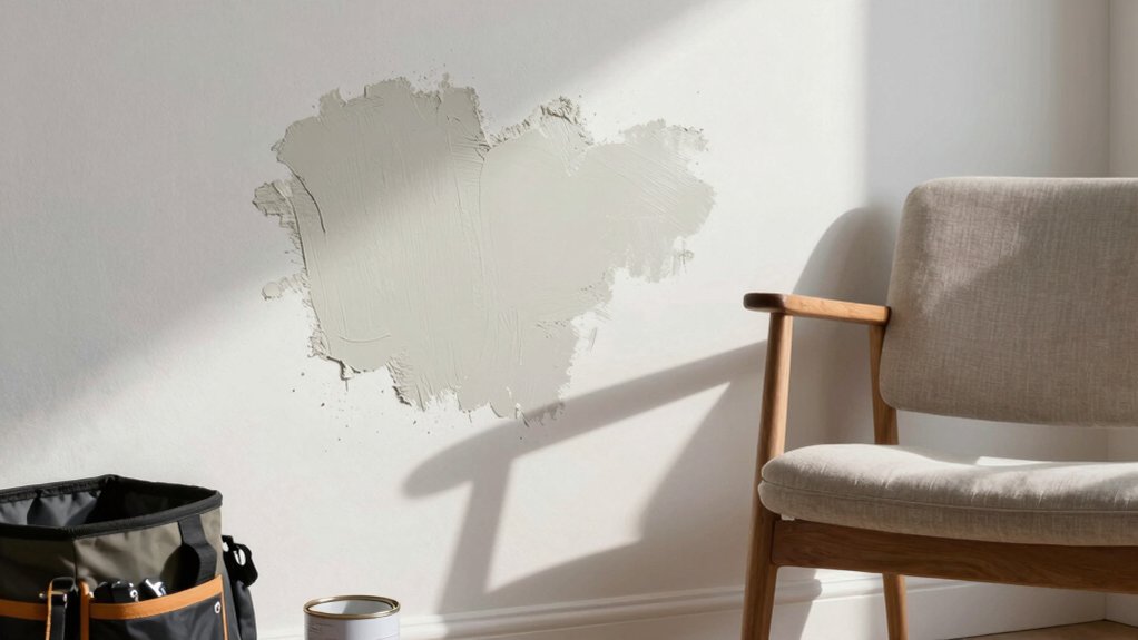
Start by selecting representative sample panels and place them in the actual rooms where the project will unfold; this guarantees lighting, furniture, and wall interactions are accounted for.
Then, apply the same coat on each panel under consistent conditions, ideally one room at a time, to compare color progression as it dries.
Allow sufficient cure time before evaluating, and photograph under the room’s lighting at multiple angles.
Assess color consistency across walls and nooks, noting any dramatic shifts or uniformity gaps.
Document texture effects as they appear, including sheen, stipple, or brushstroke visibility, since these influence perceived shade.
Rotate samples to different lighting moments to confirm stability.
Conclude with a preferred option that maintains integrity across the space and aligns with your design intent.
Predict Your Final Shade Before You Commit
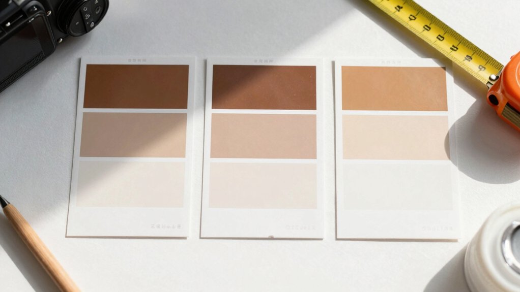
Anticipate final shade by filtering your real-room observations through a controlled prediction process. You’ll start with reliable color swatches and document your lighting, furniture tones, and wall texture.
Compare swatches two to three times under varied lighting so you notice subtle shifts. Track paint consistency by noting viscosity, sheen, and application uniformity, since these influence perceived color as it dries.
Use a midtone sample to bracket extremes, then interpolate your target shade. Apply test patches in small, neutral zones, and label each with lighting conditions and first impressions.
Reconcile differences between your real-room perception and the swatch’s stated value, adjusting for ambient light. When confident, select a formula with proven color stability and minimal color drift, ensuring your final shade remains faithful across typical room conditions.
How Finishes And Coats Change Perceived Color
Finishes alter how you perceive color, thanks to gloss, texture, and light interaction.
The thickness of each coat also shifts brightness and depth, so two identical swatches can read differently in practice.
Understanding these effects helps you predict final shade outcomes with greater confidence.
Finishes Alter Perception
Even a thin coat can shift how a color reads under different lighting, because finishes alter light interaction at the surface. You’ll notice sheen, gloss, and texture refract and reflect, changing perceived hue and warmth.
Satin and semi-gloss surfaces tend to brighten colors in daylight and complicate color matching under artificial light, while flat finishes mute contrast and enhance subtle undertones.
The finish also interacts with pigments, affecting chroma saturation and perceived depth, so two identical swatches can read differently when applied in distinct rooms.
Consider color psychology: finishes influence mood through reflected light and perceived cleanliness.
Practical implications include paint durability, where tougher coatings resist wear but may intensify color shifts at high traffic edges.
Choose a finish that balances aesthetic goals with durability requirements.
Coat Thickness Matters
Coat thickness directly shapes how color reads, because a thicker layer of paint changes light absorption and scattering at the surface. When you build coats, you’re selecting a path that alters saturation and perceived value. Thicker applications trap more pigment, boosting depth but also increasing gloss and sheen variance across edges and overlaps.
Conversely, thinner coats emphasize substrate undertones and can shift toward the base color. The progression between coats matters: inadequate dry times or uneven brushing creates microtextures that alter light flow, changing perceived hue.
Consider brush texture: rougher strokes can scatter light differently than smooth passes, subtly tinting results. In practice, plan for consistent film thickness to maximize paint durability and predictable color outcomes.
Quick Troubleshooting When The Color Surprises You
If the hue shifts unexpectedly, don’t panic—you can quickly diagnose and correct the issue. Begin with color consistency checks: compare fresh batches to the cans you’re using, and ensure you’ve mixed thoroughly. Uneven stirring, insufficient can settling, or partial pigment settlement can alter appearance dramatically.
Next, verify the paint formulation matches the project—different sheens, bases, or numbers imply variable tint strength, even within the same brand. Look for temperature and lighting effects that skew perception, since reflected light can exaggerate or mute tones.
When in doubt, test a small area under identical conditions before committing, and document batch numbers for future reference. Reconcile results by remixing or repainting with a consistent batch to restore true color.
Conclusion
Paint can’t be trusted to stay exactly what you see on the swatch. You’ll notice shades drift with lighting, room color, and the pigment-base mix, so you should anticipate a final result rather than guarantee a perfect match. Think of the process as a recipe: sample, test in real rooms, and compare under different light. When it surprises you, adjust early. Like weathered stone, your final color reveals character only after you live with it for a day.