Bright ceilings reflect more light, making rooms feel larger, while warm neutrals and whites create coziness and cohesion. For a spacious feel, try soft whites or pale blues with light, low-to-mid sheen finishes; brighter ceilings also pop when walls stay lighter and trim remains calm. If you crave warmth, choose creamy beiges or soft taupes with subtle texture. Balance under daylight and artificial lighting, then pair with appropriate moldings. Curious for more tips and examples? Keep exploring below.
Which Ceiling Colors Brighten a Room?
Light colors on ceilings reflect more light and can make a room feel brighter and larger. You’ll want hues that bounce daylight without washing out features. Begin with soft whites and pale blues or warm off-whites; these tones multiply perceived space while preserving contrast with walls.
Consider ceiling texture options—smooth planes feel expansive, while subtle textures can add depth without dampening brightness. For rooms with limited natural light, opt for tint-free whites or barely warm whites to maximize luminance.
Be mindful of ceiling height illusions: brighter ceilings can push the perceived ceiling higher, whereas too-dark shades compress volume. If you’re balancing decor, pair bright ceilings with lighter trim and mid-tone walls to maintain cohesion.
Precision in shade selection yields clarity, alters perception, and enhances overall room airiness.
How to Choose Neutrals and Warm Tones for Ceilings
Choosing neutrals and warm tones for ceilings starts with intent: pick colors that harmonize with your wall color, lighting, and furniture while enhancing the room’s mood. You should prioritize subtle contrasts that add depth without dominating the space.
Consider ceiling texture as a deliberate element: a smooth surface streamlines a modern look, while a softly textured finish can warm a cool palette.
When selecting neutrals, favor shades with undertones that echo your primary materials, not just the wall color. For warm tones, lean into creamy beiges, soft taupes, or whispery caramel hues that reflect light pleasantly.
Decorative ceiling accents, like molding or recessed panels, can elevate neutrals into refined visuals.
Test samples at different times of day to confirm the ambience you’re aiming for.
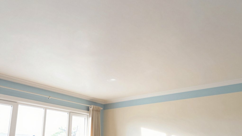
Crisp Whites vs Warm Off-Whites: Finding the Balance
When choosing between crisp whites and warm off-whites, start by defining the room’s lighting and purpose: north-facing spaces read cooler, while south-facing or sunlit rooms glow with warmer undertones.
- Crisp whites: boost contrast, enhance architectural details, and pair well with decorative ceiling patterns.
- Warm off-whites: soften edges, reduce glare, and harmonize with natural wood and textiles.
- Balance strategy: test swatches on-site, view at different times of day, and consider ceiling finishes for depth.
You’ll achieve depth with textured ceiling finishes that catch light differently and elevate plain surfaces. Choose whites with subtle undertones to prevent starkness, then anchor with lighting and accents.
This approach keeps ceilings visually integrated, avoiding a sterile vibe while preserving modern clarity.
Subtle Warm Hues That Visually Open Small Spaces
You’ll notice that warm hues, when kept subtle, can make a small room feel larger without shouting color.
Choose light-reflective ceiling finishes that bounce daylight and pair them with gentle tones to subtly expand the sense of space.
These combinations leverage warm hues, nuanced tones, and reflective ceilings to open rooms without overpowering them.
Warm Hues For Space
Warm, light-bodied warms tones help small rooms feel instantly bigger by reflecting natural light. You’ll experience space visually expanding when you choose soft warm neutrals that pair with existing finishes. Focus on how ceiling texture and ceiling moldings influence perception, not just color, to maximize brightness and cohesion.
- Balance warm shades with cool accents to prevent yellowing and keep airiness.
- Use matte or satin finishes to minimize glare while preserving warmth.
- Coordinate with trims and moldings for a seamless, taller-feeling room.
In practice, test samples on a small patch of ceiling, view at multiple times of day, and consider the room’s natural light. This approach assures warmth enhances openness without overpowering the space.
Subtle Tones Open Rooms
Subtle tones quietly expand small rooms by nudging warmth without overwhelming the eye. You’ll notice how soft, warm hues can create a sense of airiness when applied to ceilings.
Choose ceiling colors that are slightly lighter than adjacent walls to preserve brightness while adding depth. Subtle, unobtrusive tones avoid competing with architectural details, letting decorative molding catch the eye rather than compete with it.
The goal is a calm, expansive feel, not a loud statement. Consider finishes that echo ceiling texture for continuity; matte or eggshell helps diffuse light softly.
Use color as a quiet enhancer, not a feature, so you retain a sense of openness. With restrained warmth, you visually extend the room without sacrificing clarity or cohesion.
Light-Reflective Ceiling Colors
Light-reflective ceiling colors rely on soft, warm hues that bounce more light around the room, making small spaces feel brighter without glare.
- Choose ceiling tones near your wall color to avoid harsh contrast, which enhances perceived space and maintains a cohesive palette.
- Consider a low to mid paint sheen for ceilings; a satin or eggshell balances durability with subtle reflection, reducing visible imperfections.
- Factor in ceiling texture when selecting color; smooth surfaces reflect more light, while light textures can diffuse glow for a gentler ambiance.
These choices sharpen perceived height and openness, helping you maximize room brightness without oversaturation.
Pair with thoughtful lighting to complement the ceiling’s reflective qualities and maintain a balanced, airy feel.
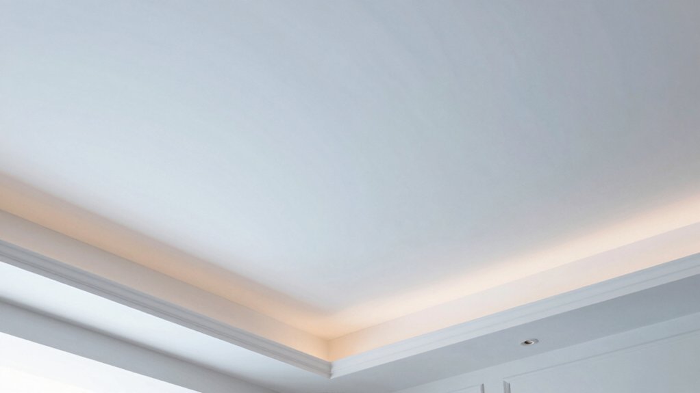
Finishes That Affect Light Diffusion and Ceiling Perception
Finishes that affect light diffusion and ceiling perception hinge on texture, sheen, and color. You’ll notice that subtle changes in each finish alter how light wraps a room, shaping perceived height and airiness.
A flat, matte ceiling minimizes glare, emphasizes spaciousness, and softens harsh shadows; it also makes imperfections more visible, so prep matters. A satin or eggshell sheen reflects more light, adding warmth without blinding brightness, while preserving a calm ceiling line.
Texture matters: ceiling texture scatters light differently than smooth surfaces, altering depth and focus. When you consider ceiling moldings or an interplay with architectural features, you’ll find form boldly communicates color intent.
Use ceiling texture and ceiling moldings deliberately to guide visual flow and enhance overall brightness.
How Ceiling Color Interacts With Lighting and Daylight
Ceiling color dramatically shapes how lighting reads in a space, because it can either amplify or dampen both natural daylight and artificial illumination. You’ll see how undertones shift with time of day, influencing mood and perceived height.
To optimize this interaction, consider these points:
1) ceiling paint sheen affects glare and diffusion, so choose matte for soft daylight and a satin or eggshell if you want brighter evenings.
2) ceiling paint application techniques matter: even coats, feathered edges, and proper edge work prevent soap-film patches that skew light.
3) test swatches under your lighting to confirm color neutrality and contrast with wall tones before committing.
Prep Steps and Durable Topcoats for Long-Lasting Color
To get lasting ceiling color, start with proper prep steps—clean, repair, and sand as needed to create a smooth, even surface.
Then choose a durable topcoat that suits your space and emissions, balancing sheen with washability for easy upkeep.
I’ll outline essential prep steps, topcoat options, and practical color-retention tips to keep your ceiling looking fresh longer.
Prep Steps Essentials
Prep steps are the foundation of a durable ceiling color. You’ll set yourself up for even coverage by cleaning surfaces, repairing cracks, and removing old sheen. Focus on adhesion and uniformity from the start.
- Prep with purpose: wash dust and grease, repair defects, and sand glossy areas to create grip for paint.
- Prime strategically: apply stain-blocking or bonding primers where needed, ensuring a uniform base for color consistency.
- Protect and plan: mask edges, cover floors, and choose a suitable roller and technique for your ceiling texture and paint application techniques.
With solid prep, you improve finish quality and reduce touch-ups. Your ceiling texture and primer choice influence final results more than you’d guess.
Durable Topcoat Choices
Choosing a durable topcoat starts with selecting the right formulation for your ceiling’s needs. You’ll want a balance of durability, washability, and aesthetic that matches your texture and lighting.
Start by evaluating ceiling texture options, since rough surfaces grip coatings differently and may require a stain-blocking primer for even color.
For sheen, paint sheen choices impact both appearance and maintenance: matte hides imperfections but wipes poorly; satin offers cleanability without glare; semi-gloss delivers superior scrubbability for high-traffic rooms.
Consider the environment—kitchens and baths benefit from moisture-resistant formulas.
Apply a compatible primer to improve adhesion and color uniformity.
Select a topcoat with excellent leveling to minimize brush and roll marks on textured ceilings, and follow recoat times precisely to preserve durability and finish.
Long-Lasting Color Tips
If you want long-lasting color on your ceiling, start with solid prep and a durable topcoat that suits texture and humidity. Clean, repair, and sand surfaces to a smooth, uniform base, then seal with a primer compatible with your paint finish.
Next, choose products that resist peeling and fading, especially in high-humidity rooms.
- Match ceiling texture to your topcoat type for even application and ideal adhesion.
- Pick a durable paint finish with excellent moisture resistance and stain repellency.
- Apply multiple thin coats, allowing proper drying time, to build color depth and resilience.
With careful prep and the right topcoat, you’ll enjoy enduring color that looks fresh in every lighting condition.
Quick Color Rundowns by Room Type and Ceiling Height
Ceiling color can dramatically impact perceived room height and mood, so quick rundowns by room type and ceiling height help you pick confidently. You’ll tailor choices by space: kitchens benefit from light sheens that resist grease; bedrooms gain calm with matte or satin for softness.
In living areas, consider slightly lighter ceilings to lift ceilings without washing out color contrast. For low ceilings, opt for brighter whites or very pale hues to open the room; for tall ceilings, deeper neutrals create warmth without overpowering the view.
When applying color, factor in ceiling texture and paint application techniques to avoid streaks and lap marks. Use precise edges at crown molding, and test swatches in multiple lighting moments to confirm the final tone.
Conclusion
You’ll discover that color isn’t just tint—it’s a whisper that softens edges and redirects light. Choose ceilings to gently lift spaces, not dominate them; let neutrals and warm whites muffle glare, while subtle hues coax warmth without crowding the eye. Prep well, seal with confidence, and let durable finishes hold your vision. If a shade feels bold, soften with daylight or dimmer switches. In imperfect rooms, a thoughtful ceiling becomes your quiet, resilient ally.