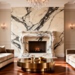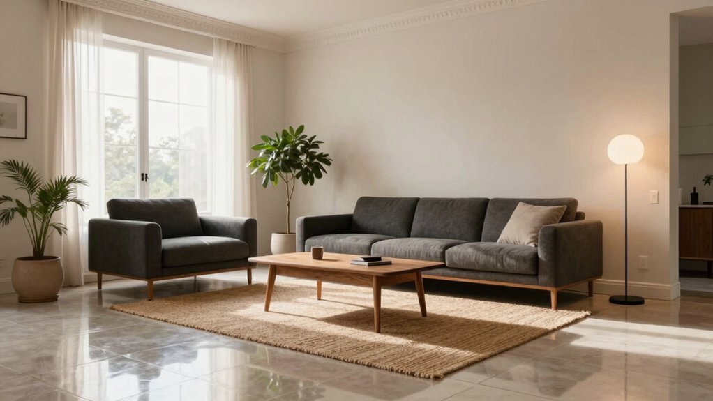
To decorate a living room with tile floors, start with a cohesive color palette that complements walls, furniture, and cabinetry, leaning on warm neutrals or cool grays and testing samples under varied light. Choose a layout pattern—grid, running bond, or herringbone—that guides traffic and aligns joints with walls. Layer textures with soft textiles, matte finishes, and carefully chosen rugs to add warmth and acoustics. Finish with layered lighting and maintenance routines; more tips await beyond this overview.
Choosing a Color Palette for Tile Floors

Choosing a color palette for tile floors starts with the room’s lighting and the overall design style. You assess how natural and artificial light shifts tones throughout the day, then map that to a baseline hue.
Use color coordination principles to pair floor colors with walls, cabinetry, and upholstery, avoiding clashes and ensuring balance. Consider undertones—warm neutrals, cool grays, or earthy beiges—to support furniture finishes.
For paint options, prioritize low-reflectance or satin finishes to minimize glare and highlight texture. Select a primary floor shade and two secondary accents for cohesion, not saturation.
Test samples in multiple lighting moments to confirm fidelity. Document your palette with hex codes or swatches, enabling precise replication across accessories and textiles without drift.
This keeps the space cohesive, functional, and visually calm.
Texture and Material Pairings to Warm Up Tile
Textures that read warm pair well with tile when you blend soft textiles and matte finishes for cozy contrast. Choose materials that balance tone with your tiles, like wool, cork, or brushed upholstery, to create a tactile flow.
Keep the palette cohesive to maintain tone-matching between surfaces and achieve a deliberate, inviting effect.
Texture Pairings That Warm
Texture pairings can dramatically alter how tile reads in a room, so combine warm, tactile textures with the cool, hard surface to soften edges and add depth. You’ll balance the geometry of tile with soft, resistant materials to retain control over airflow and light.
Prioritize textured ceramics alongside natural fibers to create subtle contrast without visual heaviness. Pair matte finishes with the tile’s sheen to reduce glare and cultivate warmth, ensuring cohesion across upholstery, rugs, and wall treatments.
Incorporate textiles like boucle, wool, or brushed cotton in seating and throws to introduce acoustic softness and tactile interest. Use wood accents or leather where appropriate, avoiding too-similar textures that read flat.
Maintain a restrained palette to preserve clarity and prevent clutter, guiding the eye with deliberate texture shifts.
Materials for Cozy Contrast
Because tile reads cool and hard, you can counterbalance it with materials that feel warmer and denser. Materials for cozy contrast focus on tactile density and visual weight, pairing high-performance tiles with plush, durable textiles and solid woods.
Opt for natural fibers—cotton, wool, felt—or performance blends in upholstery to create instant warmth without sacrificing longevity. In flooring adjacent zones, introduce area rugs with low pile or densely woven keshan-style motifs to dampen echoes and soften lines.
Accent walls in warm color accents—terracotta, amber, olive—support the palette without dominating. Choose seating frames with rounded profiles and matte finishes to contrast the tile’s sheen.
Finally, balance metal hardware and warm-toned lighting to unify texture variations into a cohesive, inviting space.
Tone-Matching With Tiles
To warm up tile surfaces, pair cool, hard tile with tactile, heat-retaining materials that read as visually dense. Tone-matching with tiles focuses on texture and material weight to create cohesive depth rather than contrast for its own sake. You’ll align surface textures—matte stone, woven fabric, and soft leather—with the tile’s cool sheen, ensuring that reflected light remains balanced across rooms.
Consider weight, scale, and color harmony; darker tones with subtle grain visually compress the space, while lighter, finely grained options preserve airiness. In exterior designs, replicate warmth inside by choosing durable textiles and wood-like finishes that tolerate humidity and sun.
For outdoor decor, select weather-ready equivalents that maintain tactile contrast without overpowering the tile’s baseline. Precision in pairing sustains a unified, inviting ambiance.
Patterns and Layout Ideas for Tile Floors
Patterns and layout choices for tile floors balance aesthetics with function. You’ll plan grids, running bonds, or herringbone to guide traffic while conserving visual flow. Choose geometric patterns to introduce rhythm without overwhelming the space, and align joints with walls or architectural cues to maintain cohesion.
Consider layout symmetry for balanced rooms; mirror central axes across doors or fireplaces to create calm, predictable surfaces. If you have irregular room shapes, use modular tiles or cut pieces to preserve a clean line while minimizing waste.
Light-colored tiles expand perceived space; darker tones anchor focal furniture. For high-traffic zones, apply larger tiles with open grout lines to reduce visible wear. Always map dimensions before purchasing to minimize seams and ensure consistent grout color.
Layering Rugs to Add Softness and Zest

Layering rugs adds depth and tactile warmth without signaling a full-room overhaul. You approach layering rugs as a controlled texture strategy, balancing scale and pile height to prevent visual clutter.
Start with a foundational rug that anchors furniture groups, ideally low-pile and neutral to avoid competing patterns. Add one or two smaller rugs with complementary tones, offsetting edges to create staggered, natural breaks.
Prioritize contrast in texture—silk, wool, jute—while maintaining a cohesive color story that echoes tile tones. This technique enhances sound dampening and adds softness underfoot, without sacrificing tile clarity.
When arranging, ensure underlay or sisal backing prevents slipping. Layering rugs, adding softness, should feel deliberate yet effortless, guiding traffic flow and defining intimate zones.
Furniture Selection to Complement Tile
When you select furniture for tile floors, aim for cohesion between style and surface; think how each piece communicates with the ground plane.
Coordinate furniture styles with the tile’s tone—sleek modern, warm transitional, or classic—while balancing proportions and scale.
Pair rug textures and seating fabrics to reinforce rhythm, depth, and tactile contrast across the room.
Coordinating Furniture Styles
Carefully pair furniture shapes and scales with your tile to create a cohesive rhythm across the room. You’ll align geometry to tile size, balancing heavy silhouettes with lighter pieces to avoid visual clumping.
Choose a restrained palette that reinforces the tile’s base tones, then introduce contrast through texture and articulation rather than color alone.
For style coordination, blend vintage accents with contemporary lines to achieve nuanced depth: think a midcentury chair beside a low, geometric sofa, or a lacquered coffee table paired with matte-finish seating.
Prioritize proportional consistency—leg height, arm width, and seat depth should echo tile proportions.
Avoid competing patterns; instead, let materiality, finish, and hardware signal distinct zones while maintaining unified modern aesthetics.
Make certain furniture layout supports traffic flow, sightlines, and functional focal points.
Rug and Texture Pairings
Rug and texture pairings tie the tile’s rhythm to the room’s tactile language, giving you surface contrast without overpowering the floor. You select area rugs that anchor seating zones while preserving airflow and light.
Choose pile height and weave to control acoustics and footfall—low piles for a crisp, modern feel; mid to high piles for warmth and comfort. Align rug color and pattern with tile undertones to avoid visual busy-ness; solids or restrained neutrals work best under statement furniture.
Incorporate wall textures to extend tactility upward, balancing scale and depth across walls and floors. Layer textiles—throws and cushions—in coordinated textures to reinforce cohesion.
Guarantee transitions between tile and rug edge are clean, with trim or a slim rug pad for stability.
Lighting Strategies That Enhance Tile Surfaces
To make tile floors glow, align lighting with the surface’s reflective qualities by combining ambient, task, and accent layers. You’ll balance brightness with color temperature to enhance tile sheen without glare.
Choose wall colors that complement reflected light and avoid stark contrasts that wash out texture. Use Lighting fixtures thoughtfully: recessed sources for even coverage, track lighting for directional emphasis, and floor lamps to add warmth in seating zones.
Opt warm to neutral temperatures (2700–3000K) near living areas; cooler tones (3500–4000K) can sharpen detail in high-contrast tile patterns. Dimmers are essential, enabling you to modulate scene mood and tile shimmer.
Install under-cabinet or toe-kick lighting to reveal grout lines subtly, avoiding harsh shadows while maintaining functional illumination. This strategy preserves harmony between form and function.
Acoustics and Sound Management in Tile Rooms
Acoustics in tile rooms hinge on managing reflections, absorption, and reverberation to create clarity without harshness. You optimize space by balancing surface finishes with controlled porosity, selecting materials that absorb mid- to high-frequency sounds while leaving intelligibility intact.
Start with floor and wall treatments that diffuse rather than trap sound, such as irregular textures or perforated panels behind seating zones. Implement soundproofing techniques where needed to minimize transference between rooms, using decoupled assemblies and resilient channels where possible.
Choose acoustic panel options that align with your aesthetic: fabric-waced or wood-faced options that complement tile tones and furniture. Layer, don’t oversaturate; combine area rugs, curtains, and upholstery to achieve a cohesive, articulate soundscape throughout the living area.
Maintenance Tips to Keep Tile Looking Fresh

Tile floors stay pristine with a regular, targeted care routine that respects both the material and adjacent surfaces. You establish a consistent schedule: daily dry microfiber dusting, weekly damp mopping with a neutral cleaner, and immediate blotting of spills to prevent staining.
Emphasize proper tools—soft pads, non-abrasive pads, and pH-balanced solutions—to minimize scratching and dullness. For grout lines, implement periodic grout sealing after cleaning to deter moisture intrusion and discoloration; reapply per manufacturer guidance to maintain barrier effectiveness.
Keep entryways clean to reduce grit transfer, and rotate furniture to prevent persistent wear patterns. Document maintenance intervals and product types for future reference.
Avoid acidic or abrasive agents near tile joints, which can erode grout and finish over time.
Accessory and Decor Placement for Cohesion
Strategic accessory and decor placement creates a cohesive living room with tile floors by balancing scale, texture, and color. You’ll anchor furniture groups with mid-sized pieces to avoid overwhelming the floor pattern, then add accessories that repeat tones from tiles for harmony.
Use decorative wall art to create focal points at eye level, selecting frames that echo cabinet or furniture finishes to unify the room. Consider a limited palette to prevent clashing tiles; introduce contrast through texture rather than color when possible.
Place ceiling treatments to guide the eye upward, coordinating with rug edges and throw textiles for continuity. Keep surfaces uncluttered, rotate pieces seasonally, and test lighting angles to ensure shadows enhance architectural lines without breaking cohesion.
Style Inspirations for Various Tile Types
Whether you’re working with porcelain, ceramic, natural stone, or glass tile, style inspirations should start with the tile’s inherent character and finish—then align with your overall room palette and textures.
For porcelain, emphasize clean lines and subtle gloss to support modern minimalism, pairing with cool neutrals and metal accents.
Ceramic tiles invite warmer palettes and tactile grouts, so layer with textured fabrics and vintage patterns to create a curated, lived-in feel.
Natural stone demands restraint; showcase its veining with solid wall colors and restrained wood tones.
Glass tiles shine as reflective accents, best paired with crisp white, high-contrast furnishings, and geometric shapes.
In all cases, balance scale, grout color, and accessory density to maintain cohesion.
Conclusion
You’ve learned how tile sets the room’s tone, from color and texture to layout and rugs. Apply a cohesive palette, mix finishes thoughtfully, and keep scale in mind for furniture. Layer softness with textiles, and use rugs to define zones without overcrowding. Maintain with simple wipes and grout care, then step back to admire a space that’s functional and refined. Remember: first impressions count, so your room should feel intentional and timeless—like “less is more,” but better.