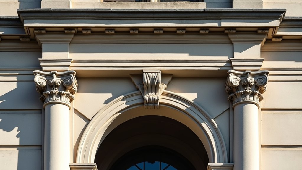
You may not notice it at first glance, but you’ll want to start with a subtle hint of contrast that sets a clear profile for every edge. You’ll select high-contrast pairings—dark trims on light walls, or vice versa—then prep the surface meticulously to guarantee crisp lines. You’ll test under varied lighting and choose a sheen that reveals texture without glare, applying with masking and fine brushes. The next step holds the key to predictable results, if you’re prepared to manage the details carefully.
Get Immediate Contrast: Quick Start for Architectural Details
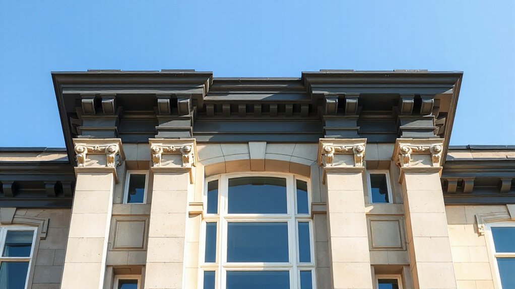
To achieve immediate contrast on architectural details, start with a high-contrast color pair (for example, a dark trim against a light wall). You then document baseline measurements, noting surface condition, substrate type, and moisture status, so you can predict long-term performance.
Apply a primer tailored to the substrate, ensuring uniform adhesion and minimal bleed-through, followed by a topcoat with a high-reflectance finish for crisp delineation. Use defined edge control during application, and verify color registration under typical lighting to prevent illusionary shifts.
Prioritize historical accuracy in detailing, matching era-appropriate profiles and finish methods where feasible. Consider environmental impact by selecting low-VOC formulations and minimizing waste through precise mixing and returnable containers.
Record results for reproducibility and future maintenance planning.
Decide Your Contrast: Color Selection for Wood, Plaster, Brick, and Stone
You determine contrast by pairing the natural wood tone with next-step material colors that enhance detail without overpowering it.
Consider how plaster, brick, and stone absorb or reflect light to inform your wood-tone choice, aiming for clear separation or purposeful harmony.
This approach establishes a precise framework for Wood Tone Contrast and Material Color Pairing across your surfaces.
Wood Tone Contrast
When selecting a wood tone for contrast, balance is key: the goal is to make the wood stand out without competing with the surrounding materials. You should define a contrast that preserves legibility of details and emphasizes the grain without overwhelming plaster, brick, or stone surfaces.
Choose a wood tone two to three steps lighter or darker than adjacent finishes, ensuring a clear tonal separation that remains cohesive. Apply a controlled finish that enhances texture and minimizes glare, facilitating accurate perception of edges and profiles.
Consider furniture pairing to anchor rooms and guide eye movement, while interior accessories reinforce the contrast without crowding the palette. Document color tests, verify under varied lighting, and maintain consistency across doors, trim, and built-ins for precise, durable results.
Material Color Pairing
For wood, favor mid to dark tones that accent grain while ensuring sufficient light reflectance for clarity.
Plaster benefits from cooler neutrals or toned whites to emphasize relief without creating glare.
Brick demands restrained, complementary tones to highlight mortar lines and texture.
Stone accepts higher chroma contrasts if you maintain subdued reflective values to avoid detraction.
Consider finish durability and surface preparation to optimize longevity. Material durability informs coating choice, while paint application techniques—substrate conditioning, primer use, and layer sequencing—determine observed contrast, permanence, and overall legibility.
Test Lighting Now: Natural and Artificial Scenarios to Measure Impact
To assess how contrasting paint interacts with architectural details, conduct controlled lighting tests that compare natural daylight and artificial sources across representative surfaces.
You’ll document spectral quality, light intensity, and color rendering index to quantify how hue shifts and shadow depth reveal or mute details.
Set up calibrated fixtures to simulate morning, noon, and evening daylight, then swap in tuned artificial sources that mimic warm and cool spectra.
Measure contrast thresholds at defined viewing angles and surface textures, recording luminance values, chromaticity coordinates, and glare.
Analyze how lighting ambiance influences perceived form, edge definition, and color harmony across materials.
Use findings to guide placement, duration, and mix of lighting to optimize detail preservation without distortions.
Choose Sheen to Enhance Texture: Matte, Satin, or Semi-Gloss
You’ll choose Matte to maximize texture, emphasizing surface irregularities without glare.
Satin distributes light more evenly, softening edges to enhance perceived depth and subtlety.
Semi-Gloss adds deliberate contrast highlights, clarifying form while balancing durability and washability.
Matte Texture Enhancement
Choosing the right sheen is essential for enhancing texture without overpowering the surface. Matte texture enhancement relies on a low-sheen finish to reveal subtle contours while minimizing glare. You should apply a true matte coating to emphasize architectural recesses, cornices, and moldings without producing reflections that wash out detail.
Prepare surfaces thoroughly, ensuring no glossy residues remain, to maximize adhesion and uniform color development. In this scenario, textured finishes benefit from consistent, even porosity; any variation will disrupt the perceived depth.
Matte also contributes to paint durability by resisting fingerprint smudges and maintaining a stable film under differing environmental conditions. Use a high-quality, low-luster product specified for interior/exterior exposure, and monitor temperature and humidity during application and cure.
Satin Light Diffusion
This sheen harmonizes with dry-wall inset, moldings, and ornamented profiles, creating uniform illumination while preserving depth. In practice, you leverage lighting techniques that emphasize midtone gradations, avoiding specular hotspots that wash fine textures.
The satin surface moderates reflections from wall and ceiling planes, extending perceptual texture without sacrificing legibility. Apply consistent coats to preserve a steady paint finish, then test under varying ambient angles to confirm even diffusion.
Document results for future comparisons, ensuring the chosen finish supports both aesthetic intent and functional readability of details.
Semi-Gloss Contrast Height
Semi-gloss finishes heighten contrast and reveal finer texture details more aggressively than satin, making them a purposeful choice when you need pronounced legibility of ornamented profiles and edge definition. You select semi-gloss to maximize light catch across high-contrast edges, ensuring crisp delineation between mouldings and recesses.
This sheen amplifies micro-texture without washing out surface subtleties, but it requires careful preparation to avoid showing imperfections. For color harmony, pair semi-gloss with restrained hues to prevent glare and maintain tonal balance.
Texture blending matters: deliberate use of glaze or wash can soften progressions in adjacent surfaces while preserving focal contrast. Apply even coatings with consistent tool marks, and evaluate under the intended lighting to confirm legibility.
In practice, semi-gloss height supports precise architectural reading and durable finish performance.
Step-by-Step Application: Molding, Trim, and Cornice
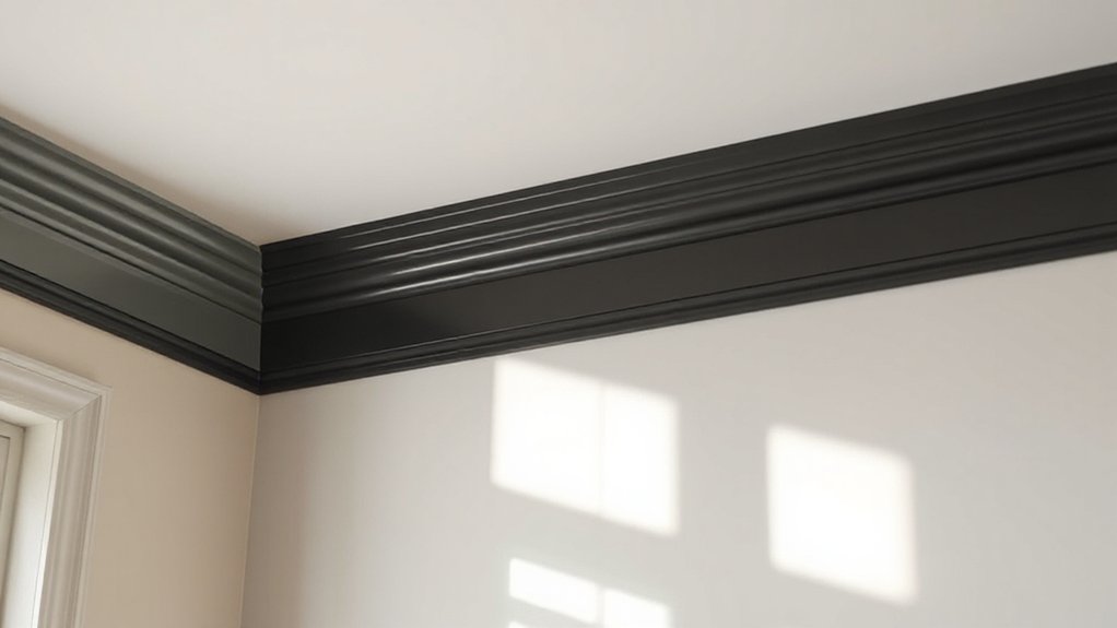
To apply molding, trim, and cornice with precision, start by preparing the surface and conditioning the painting environment, then protect adjacent areas with painter’s tape and drop cloths.
You’ll follow a controlled sequence, using contrast to emphasize profiles while preserving Historical accuracy and honoring Cultural influence.
- Assess profiles and select compatible gloss levels for durable finish and legibility.
- Prime with a bonding primer on raw wood or repaired plaster to ensure uniform absorption.
- Apply a precise base coat, then glaze or highlight with a contrasting color using a fine brush.
- Seal edges with crisp, clean lines by removing tape before full cure.
Maintain steady hand, steady lighting, and consistent drying times for repeatable, professional results.
Troubleshoot and Balance: Common Pitfalls and Fixes
Even with careful planning, common pitfalls can derail a finish when highlighting profiles with contrasting paint; anticipate these issues and address them systematically.
First, verify color harmony across adjacent surfaces; mismatched undertones produce visual noise and undermine legibility of profiles.
Second, manage edge crispness by using sharp masking and proper top-coats to prevent bleed-through and feathering.
Third, monitor paint durability under lighting and humidity; fluctuating conditions can cause fading or cracking, so choose durable formulations and appropriate primers.
Fourth, align sheen levels to avoid glare or dull contrasts that flatten detail; consistency in gloss helps preserve legibility from multiple viewing angles.
Finally, document application timings and drying conditions to reproduce results reliably, ensuring long-term color stability and preserved architectural emphasis.
Frequently Asked Questions
How Long Does the Color Lasting Typically Take to Cure Fully?
Paint typically cures to full depth in 7–14 days, depending on humidity and temperature; you’ll see surface cure sooner, but full hardness and color longevity emerge as solvents fully evaporate.
In cooler, drier conditions allow longer cure times.
For interior walls, plan 7 days before light traffic; exterior coatings may take up to 14 days.
Monitor adhesion and avoid washing until cured.
Paint durability improves with proper ventilation; color longevity remains higher when you respect cure windows.
Can Contrasting Paint Affect Room Acoustics or Sound Absorption?
“Measure twice, cut once.” Yes, contrasting paint can affect room acoustics, though effects are usually subtle. You’ll notice minor changes in sound absorption due to surface texture, pigment density, and finish sheen.
A high-gloss or very smooth coating reflects more sound, while matte surfaces improve acoustic diffusion. Consider choosing paints with minimal volatile organic compounds and ideal texture to achieve the desired Acoustic impact and balance intelligibility in your space.
Which Tools Minimize Brush Marks on Detailed Molding?
You want to minimize brush marks on detailed molding, so use precise brush techniques and quality paint primers.
Start with a high-quality angled sash brush for tight corners, load lightly, and avoid overloading to reduce drag.
Seal edges with a primer tinted close to final color, then apply thin, even coats with long, smooth strokes.
Build opacity in stages, sanding lightly between passes.
Finish with a compatible topcoat; repeat as needed for flawless, uniform coverage.
Are There Safety Concerns When Painting Over Lead-Based Finishes?
Yes, there are safety concerns when painting over lead-based finishes. Lead safety matters, and you must follow stringent protocols.
Use containment, respirators, and proper disposal; isolate and seal work areas to prevent dust migration.
For stubborn coatings, consider lead-safe paint removal methods and ventilation.
Never dry-scrape or burn off lead paint.
Regularly test and monitor air, and dispose of contaminated materials as hazardous waste.
This protects you, your household, and your surroundings.
How Do Humidity and Temperature Affect Paint Adhesion on Plaster?
Humidity impact and temperature effects directly influence paint adhesion on plaster. You’ll see reduced adhesion if humidity is high during application, causing prolonged drying and a soft film.
Low humidity speeds curing but may cause cracking. Temperature should be steady and within product spec, preventing rapid moisture loss.
You’ll improve adhesion by acclimating plaster, maintaining consistent conditions, and using appropriate primers.
Humidity impact and Temperature effects must align with manufacturer guidelines for durable, long-lasting coats.
Conclusion
Think of contrast like a street sign for your building’s personality: bold, legible, and purposeful. You’ll have precise color choices, tested under real lighting, and a consistent sheen for texture. Anecdote: a façade once read flat until a sharp white trim on warm plaster boosted perceived depth like a doorway that suddenly invited you in. Data point: properly primed surfaces reduce edge bleed by 80%. By applying these steps, you’ll achieve durable, crisp architectural details with confident accuracy.