Interior colour schemes trending across UK homes lean toward warm neutrals, nature-inspired greens, and crisp whites to expand spaces. Think soft, breathable neutrals paired with cool or warm whites, plus layers of texture. Terracotta adds coziness, while sage and olive bring calm, outdoorsy vibes. Navy, Delft, and midnight accents ground rooms, with bold walls sparking conversation. Practical pairings—lighting, wood tones, and tactile fabrics—anchor the palette. If you keep exploring, you’ll uncover how to apply these trends in your space.
Calming Neutrals for UK Homes

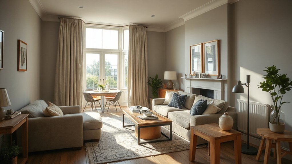
Calming neutrals are the foundation of a serene UK home. You choose hues that harmonise with natural light and room function, keeping palettes cohesive from hall to living spaces. Focus on soft, breathable tones that don’t shout, letting architectural features lead.
Color psychology guides your selections: cooler neutrals can tranquilise busy days, warmer neutrals invite coziness, and muted contrasts prevent visual fatigue.
When applying paint, start with a high-quality primer to guarantee even tone and true colour. Use consistent finish across walls—matte for living areas, eggshell for kitchens and baths—to balance sheen and practicality.
Paint application techniques matter: cut in sharply, roll corners with steady, overlapping strokes, and maintain a wet edge.
Test swatches in multiple lights; final choices should feel effortless and refined.
Soft Whites and Off-Whites That Expands Space
Soft whites and off-whites can make rooms feel larger by reflecting natural light and reducing visual weight. You’ll appreciate how these shades subtly open spaces without shouting color. Use them as the base in living areas, kitchens, and hallways to create a cohesive backdrop that enhances architectural features.
Keep the palette cool or warm to suit your lighting and fabrics, avoiding stark contrasts that fragment the room. Introduce depth with varied textures—timber, linen, or matte ceramics—to prevent flatness.
Accent walls in a slightly deeper white or off-white can define zones without overpowering the space. Consider colour psychology: softer whites promote calm and focus, while gentle warmth boosts approachability.
Balance with strategic accessories and lighting for a timeless, spacious feel.
Warm Terracotta and Clay Hues for Coziness
Warm terracotta and clay hues bring warmth to your space, grounding palettes with earthy tones that feel inviting and timeless. Imagine clay-draped living rooms where muted reds and browns pair with natural textures to create cozy, welcoming zones.
Use ember accents—think burnt orange cushions, copper lighting, and warm wood—to finish the look with practical, everyday impact.
Warmth Through Terracotta
Terracotta tones bring immediate warmth to UK homes, pairing earthy clay hues with modern neutrals to create inviting living spaces. You’ll notice warmth stems from subtle contrasts: warm terracotta walls, rust accents, and charcoal trims that anchor furniture without overpowering the room.
Use this palette to build depth: choose a dominant terracotta shade for feature walls or a sofa, then layer lighter neutrals to keep the space breathable. Finishing touches matter: vintage ceramics add character, while indoor plants bring life and a touch of green that enhances the clay’s warmth.
Keep textures varied—linen, cotton, and woven fabrics prevent flatness. Apply lighting strategically with warm bulbs to amplify coziness without shifting color balance. This approach delivers comfortable, enduring interiors.
Clay-Draped Living Rooms
After embracing warmth through terracotta, you can wrap your living space in clay-draped comfort that feels both contemporary and inviting. You’ll cultivate a calm, cohesive mood by leaning on warm terracotta tones paired with textured textures and natural materials.
Focus on balance: allow clay to animate walls or furniture without overwhelming the room. Textured clay finishes add tactile depth, while statement clay accessories punctuate accents with subtle drama.
- Use textured clay finishes on a feature wall to anchor the room without shouting.
- Choose statement clay accessories—vases, bowls, and lamps—in varying shapes and sizes.
- Pair clay elements with neutral textiles and soft lighting to maintain peaceful contrast.
Cozy Ember Accents
Embrace the glow of Cozy Ember Accents by layering warm terracotta and clay hues to create instant coziness. You’ll elevate rooms by using these tones on walls, textiles, and cabinetry, then balance with neutral basics to avoid overwhelm.
Implement a deliberate palette: burnt sienna, clay, and terracotta as anchors, with lighter beiges as relief.
Introduce fireplace mantels as focal points, in complementary finishes that don’t compete with surrounding art.
Pair ambient lighting with dimmable sources to shift mood from warm to intimate as needed.
Choose textures that enhance warmth—textured plaster, matte ceramics, and woven fabrics.
Keep accessories minimal and purposeful, letting color do the talking.
The result: a cohesive, inviting atmosphere that feels timeless, not trendy, and easy to refresh.
Sage Greens and Olive Tones for Nature-Inspired Living

Sage greens and olive tones bring a calm, nature-led feel to interiors, pairing well with natural textures and muted woods. You’ll find these hues create a versatile backdrop, supporting both bright accents and soft, muted palettes. Use them to ground spaces without overpowering them, letting texture and form take the lead.
- Implement garden inspired palettes by layering olive with warm taupe and moss for cohesive, outdoorsy rooms that remain refined.
- Vary saturation through furniture tones, accessories, and wall coverings to build depth without clutter.
- Highlight botanical accent walls with subtle patterns or a matte finish to draw the eye and unify natural materials.
These approaches reinforce a calm, practical aesthetic while keeping interiors connected to nature.
Blue Hues: Navy, Delft, and Midnight Accents
Blue hues bring depth and focus to UK interiors, with navy, Delft, and midnight accents shaping rooms that feel cocooned yet contemporary. You’ll use navy as a grounding base for living rooms, complementing natural light with crisp whites or warm wood tones to preserve balance.
Delft pops work best as accents—think soft pottery, textiles, or accessories—to introduce charm without overpowering. Midnight shades excel in statement pieces like shelving or a feature chair, adding depth and a refined edge that reads modern rather than heavy.
Pairing these tones with metallics or pale neutrals keeps spaces fresh. Navy sophistication emerges when contrasts stay intentional, while Delft charm softens the palette for calmer bedrooms and bathrooms.
Apply this trio with restraint to maintain cohesion and practical usability.
Bold Statement Walls That Spark Conversation
Bold walls make a statement, so you set the tone the moment guests step in. When you choose a bold color or finish, you invite bold dialogue and spark conversations that linger beyond the room.
Let your walls speak loudly, then balance the look with careful lighting and furniture to keep the room cohesive.
Bold Walls, Bold Dialogue
Bold statement walls are making rooms talk. When you choose bold walls, you set the tone for every conversation that follows, guiding how you and guests perceive space. You’ll find that color can act as a catalyst for mood, focus, and flow, so plan around function as much as flair.
Accent furniture and artistic murals complement the drama without competing with it; they anchor the room and provide visual rest stops. To integrate boldly, start with a single feature wall, then layer neutrals elsewhere to maintain balance. Use lighting to modulate intensity.
- Pair bold walls with restrained palettes on trim and textiles.
- Position accent furniture to foreground the room’s dialogue.
- Introduce artistic murals as complementary statements, not competing themes.
Statement Walls Speak Loudly
Statement walls aren’t shy about it: they can set the room’s entire tempo. You’ll use bold colour, texture, or pattern to anchor furniture, lighting, and art without overwhelming the space.
Start with accent wall ideas that align with your ceiling height and natural light; a deeper hue can create depth, while a soft tone keeps balance. Keep the rest of the room in neutral or restrained tones to preserve contrast and readability.
Choose statement wall art that reinforces the wall’s character—scale matters, so opt for pieces that breathe alongside the wall rather than compete with it.
Practical execution: patch, prime, and test swatches at different times of day. Trim clutter, and let the wall be the conversation starter.
Monochrome Palettes With Textured Layering
Monochrome palettes thrive on contrast, but texture is what keeps them inviting. You layer depth through tactile materials, preventing flatness and adding warmth without deviating from the color scheme. Focus on high-contrast neutrals, then introduce texture to differentiate zones and surfaces.
- Textured wall finishes provide visual interest without breaking the monochrome balance, from stucco to linen plaster.
- Monochrome accessories—think ceramic vases, rugs, and cushions—anchor the palette while adding subtle variation.
- Layered fabrics and natural materials create dimension, helping light bounce and shadows form crisp edges.
Keep finishes matte or lightly satin to preserve cohesion. Avoid busy patterns that clash with the clean lines you’re cultivating. The goal is refined restraint: tactile elements that read as one cohesive, elegant space.
Practical Pairings: Lighting, Wood and Fabric to Support Color

Lighting, wood, and fabric aren’t afterthoughts in a monochrome scheme—they’re the levers that make texture read as texture and color feel cohesive. You’ll align lighting to enhance depth: warm whites for softness, cool tones for contrast, and layered fixtures to create zones without clutter.
Select wood tones that echo the color you’re supporting, not competing with it—think mid-tones for versatility or lighter ash for airiness. Fabrics should add tactile contrast: a matte weave with a glossed accent or a velvet for richness, kept within your palette to maintain cohesion.
Plan furniture placement to foster flow and accessibility, avoiding visual interruption. Wall art coordination matters: curate pieces that echo key hues and scale to room proportions. This keeps the palette unified and adaptable.
Quick-Start Guide to Trialing Colour in UK Homes
Trying color in your UK home doesn’t have to be scary or costly; start simple, test in real rooms, and learn what actually reads on your walls. A quick-start approach keeps momentum while you build confidence in color psychology and how tones affect mood.
Begin with small swatches, then paint test patches on wall panels or poster boards to compare under different lighting. Document responses to each shade and adjust accordingly.
Focus on paint application techniques that minimize mess and maximize accuracy, like cutting in edges first and layering thin coats. Use daylight as your baseline and note how artificial lighting shifts perception.
- Test multiple hues in real rooms with varied lighting
- Log reactions and refine choices using swatches
- Apply and retreat with controlled, layered coats
Frequently Asked Questions
How Do I Test Colours Before Painting a Whole Room?
Yes—test colors before painting full walls. Use large paint samples on poster board or wall sections; observe in different lights. Consider color psychology, and do paint sample testing over a day or two to verify mood and hue.
What Lighting Affects Perceived Colour Most in UK Homes?
Lighting design most affects perceived colour, especially in UK homes, where varying daylight and artificial sources shift hues. You’ll notice this quickly; know Colour psychology guides choices, so test under different lights to avoid surprises.
Which Finishes Enhance Colour Without Darkening a Space?
You’ll want finishes with light reflectivity and subtle texture, like satin paints or light natural woods, to brighten without darkening. Texture contrasts and colour psychology guide choices, helping you amplify colour while keeping spaces airy and balanced.
How Often Should I Refresh Colour Schemes Seasonally?
Refresh color palettes seasonally about every three to four months, you’ll ride Seasonal trends smoothly. In fact, 60% of homeowners report renewed satisfaction when updating a Color palette quarterly.
Can I Use Colour to Visually Enlarge Small Rooms?
Yes, you can. Use light, cool colours and whites to boost colour psychology for calmness, and rely on high-contrast accents to influence visual perception, making spaces feel larger while maintaining balance and cohesion.
Conclusion
You’ll swear these colors can single‑handedly redesign reality. Calming neutrals stroll through UK homes like quiet heroes, while soft whites seem to *seem bigger* than the horizon. Terracotta warmth hugs you, sage greens whisper of gardens you’ll actually visit, and navy to midnight blues punch up personality like a mic drop. Bold walls demand attention, but keep it balanced with texture and light. Quick trial tips? Paint swatches, observe, repeat. Color conquers space—you just have to start.