To match paint already on a wall, start by sampling representative spots that reflect the wall’s midtones, highlights, and textures. Use clean, calibrated tools and label each sample with location and lighting. Check color under daylight, incandescent, and LED to spot hue shifts, then choose a shade that stays true across conditions. Recreate the finish and texture with careful brushwork or stippling, blending edges for invisibility. If you keep exploring, you’ll learn even more precise steps and tricks.
What Color-Matching in Place Actually Means and When to Use It
Color-matching in place is exactly what it sounds like: matching a paint color directly on the wall where it’ll be used, without removing or repainting large areas. You assess a patch, shade, or room corner and determine if a quick match serves the project goals.
This approach works when you need a seamless integration, repairs, or touch-ups that should stay invisible. Use your color wheel to compare hues, tones, and undertones quickly, identifying the closest match to the surrounding finish.
Consider paint storage implications: keep samples labeled, protected, and organized so you don’t lose reference chips or reuse mismatched tones.
Decide if a spot repair suffices or if a broader refresh is warranted, then proceed with a precise, controlled application for minimal disruption.
Gather Sampling Tools and Decide What to Sample
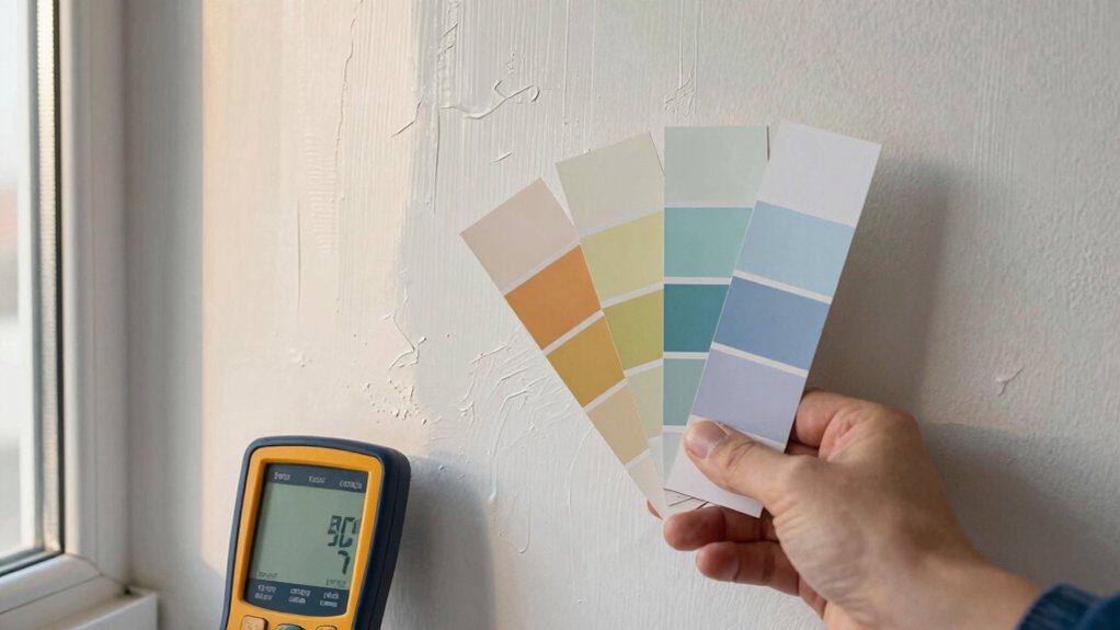
You gather the right sampling tools, from a quality colorimeter to clean swatches, so you can obtain reliable readings.
Decide what to sample by prioritizing representative areas and finish types that matter for your wall.
Plan your sampling approach now, outlining where and how you’ll take samples to guarantee consistent results.
Gather Proper Sampling Tools
To gather proper sampling tools, start by choosing a calibrated colorimeter or spectrophotometer, a high-quality paint sampler, and clean, lint-free cloths; these items guarantee accurate color capture and uncontaminated results.
- Maintain color standards during each check to guarantee consistency.
- Carry spare calibration tiles and a protective case for zero drift.
- Rely on reliable sampling methods that minimize surface disturbance.
You’ll use the right tools to obtain repeatable, trustworthy data, forming the backbone of color matching.
With the equipment in hand, you can log readings efficiently and compare against established color standards. Keep sessions clean, documented, and time-stamped to support precise color decisions.
This groundwork supports, but doesn’t dictate, the subsequent sampling strategy, ensuring you stay focused on measurement quality first.
Decide What To Sample
Carefully decide what to sample by identifying the most visible and critical color areas on the wall, then align your tools to each target. You’ll prioritize dominant midtones, highlights, and any unique accents that define the scene. Treat color consistency as your goal: sample areas should represent the overall hue, not minor blemishes.
Use your sampling tools to capture both surface color and subtle shade shifts caused by lighting, sheen, or aging. Decide whether you need a single composite sample or multiple targeted swatches for a gradient match. Consider color theory basics to anticipate perceived differences, and plan for paint formulation by noting base, tint strength, and finish.
Record locations and conditions so your reproduction can align with the original mix, ensuring a faithful, durable match.
Plan Sampling Approach
Plan your sampling approach by clustering the wall into its most visible color zones and selecting the right tools for each target. You’ll gather swatches, jars, a labeled pen, and a clean cloth.
Decide what to sample from each zone: midtones first, then highlights and shadows, to anchor color theory basics.
Use a light, neutral background to compare hue shifts, then confirm with a swatch system to reduce mismatch.
Choose brush techniques that maximize pigment pickup without oversaturation, and keep edges clean for precise reads.
Plan to sample in even lighting and record results immediately.
Sample Strategy: Where and How to Collect Representative Spots
You’ll start by outlining Spot Collection Basics to make certain you gather representative samples without bias.
Choose Sample Area Selection methods that cover color variation, surface wear, and finish, then benchmark against Color Matching Standards.
Keep the process practical and repeatable so every spot informs an accurate color match.
Spot Collection Basics
Spot collection is about selecting spots that accurately represent the wall’s color and finish, so you can sample once and get results you can trust. You’ll focus on representative patches, not edges or corners alone, and avoid atypical sheen. Keep conditions consistent: lighting, humidity, and wall texture stay steady during sampling.
Use simple, repeatable steps to compare spots quickly, ensuring your final match isn’t skewed by a single anomaly. Pay attention to surface flaws that might skew color perception, and note them for later correction. Brush techniques and paint storage matter; clean tools prevent color contamination, and proper storage preserves consistency between sessions.
- Test in multiple small spots for a true average
- Label samples with location, lighting, and date
- Maintain a clean, organized workflow to minimize variables
Sample Area Selection
To choose representative spots, map the wall into a few logical zones based on texture, sheen, and color variation, then target patches that reflect those zones rather than random areas.
You want spots that truly sample the dominant finishes, not isolated quirks. Identify zones such as flat, eggshell, satin, or glossy areas, plus textured patches like stucco or knockdown.
Select multiple spots per zone to capture variation within that finish. Keep a balanced distribution so you don’t overemphasize one region.
Use consistent lighting when sampling to avoid misleading shifts. Record location, surrounding finish, and any staining or aging.
This approach aligns with color theory principles and informs paint formulations, ensuring the match reflects the wall’s overall character rather than a biased snapshot.
Color Matching Standards
Color matching standards set a clear framework for where and how to collect representative spots. You’ll define areas that reflect lighting, texture, and age differences, ensuring samples represent the whole wall. Focus on consistent application, avoiding edges and corners that skew results.
Document each spot’s context—finish, sheen, and position—to support color harmony across the project. Use standardized sizes and tools, then compare against a controlled palette to avoid drift. Accuracy wins here; hurried sampling leads to mismatches and rework.
- Select spots with varied lighting and reflective surfaces
- Record paint sheen and substrate texture for every sample
- Verify results under multiple light sources before finalizing color choice
Test Color Across Lighting Conditions: Daylight, Incandescent, and LED
When you test color across daylight, incandescent, and LED lighting, begin by selecting a single, representative paint sample and view it under each light source at the same distance and angle. Do this firsthand to see how the hue shifts, not just how it appears on a swatch.
Compare swatches in natural daylight, then under warm incandescent, and finally under cool LED. Note whether the color reads warmer, cooler, or more neutral in each setting. Use this test to judge color psychology—how the shade feels in real rooms—and to anticipate mood changes with time of day.
Record observations, then assess paint durability under wear and fading risk in typical luminance. Choose a finish and shade that stays true, balanced, and practical across environments.
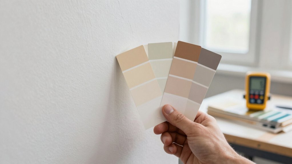
Compare Brands and Finishes Without Repainting
You don’t need to repaint to compare brands and finishes effectively. Focus on color wheel relationships and finish compatibility to avoid misfires. Compare base colors side by side, then check sheen, durability, and cleanability to see how they align with your wall’s undertones.
Use swatches or sample cards under the same lighting as your wall to assess true color behavior. Look for consistent color across brands and ensure the finish shares similar gloss and texture to what you already have. This reduces surprises after application and helps you pick with confidence.
- Color wheel harmony: pick nearby hues to minimize shift
- Finish compatibility: match sheen, durability, and washability
- Subtle undertones: verify subtly different tints don’t clash
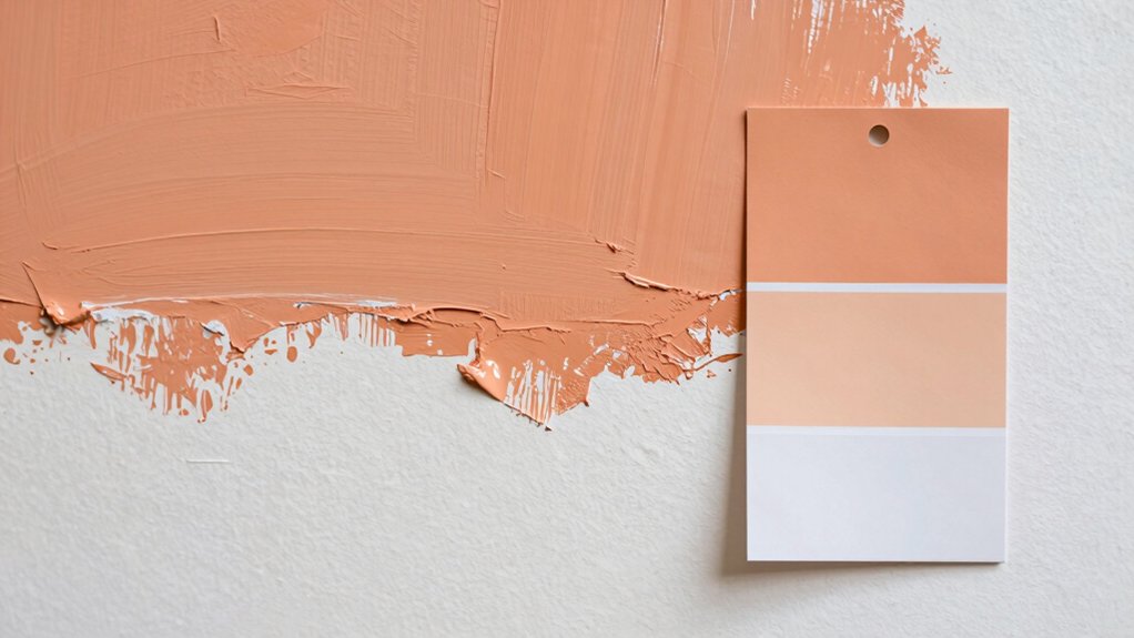
Application Techniques That Blend: Quick Touch-Ups and Texture Matching
To blend quickly and seamlessly, focus on targeted touch-ups and texture matching that disappear into the surrounding wall. You start with a tight color match and a small, high-quality brush. Use short, feathered strokes to cushion edges and avoid hard lines.
For texture blending, apply a light stippling or tapping motion where the wall texture differs, then lightly roll over with a dry brush to marry the finish. Keep the paint consistency slightly thicker than background paint to prevent sagging, and wipe excess from the rim of the can to prevent drips.
Work in small sections, blending outward toward undamaged areas. Brush techniques and texture blending are your tools to create a seamless repair that remains invisible.
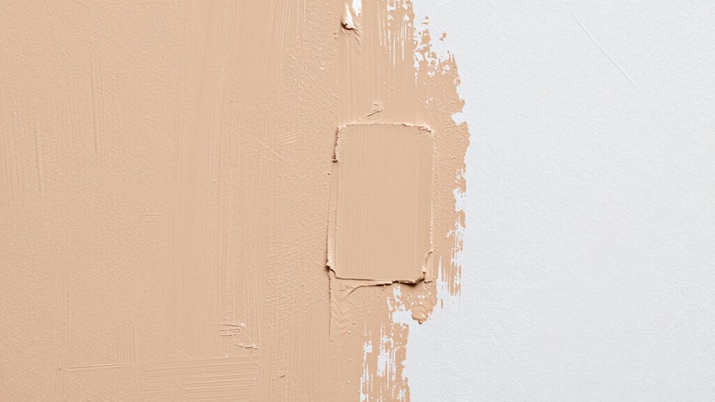
Troubleshooting and Retesting Under Different Light
Light changes can reveal color or texture mismatches you didn’t notice under basic lighting, so start by rechecking the repaired area under the lighting conditions you’ll usually see it.
When retesting, use a known reference: compare against adjacent walls via the color wheel concept, noting hue, value, and saturation shifts.
Assess paint sheen as glare or matte can exaggerate or hide flaws; confirm the finish matches surrounding surfaces at multiple angles.
If discrepancies appear, adjust with a small, controlled mix and recoat a test patch.
Only proceed after the patch dries fully to evaluate true color.
Be systematic and document results.
- Compare under daylight, incandescent, and LED
- Note color wheel relationships and sheen differences
- Reclean–recoat until uniformity is achieved
Conclusion
You’ve got this. By sampling representative spots and testing under daylight, incandescent, and LED, you’ll pick a color that truly matches the wall, not just a swatch. Compare brands, finishes, and textures without repainting, then blend with quick touch-ups and proper technique. If it looks off, retest and adjust in different light. Think of the process as a lighthouse in fog: steady, guiding you to a seamless finish. Stay patient, repaint only as needed.