This year, UK homeowners favour warm neutrals for coziness and light, deep hues for drama and retreat, and nature-inspired greens and blues to echo garden and landscape. Plan with a core neutral, layering complementary shades and accent pops for cohesion. Consider texture and durable finishes with subtle sheen, and align exterior schemes to garden tones for seamless shifts. Test large swatches under varying daylight, refine to two finalists, and explore budget-conscious swaps under £50 per tin—more insights await.
Identify Your Palette: UK Colour Trends Explained

Identifying your palette starts with understanding current UK trends and how they translate into real spaces. You’ll assess color direction across residential sectors, noting how light, texture, and materiality shift perception.
In practice, this means mapping hues to rooms by function and mood, then testing swatches under varied daylight to confirm legibility and cohesion. Consider color psychology to anticipate psychological responses—calm tones for work areas, energizing accents for social zones, and grounding neutrals for balance.
Historical influences inform modern choices: archival palettes from mid-century, industrial chromatics, and vernacular cottage hues reappear with contemporary saturation. Build a core board around a dominant hue, then layer complementary shades and accent pops that reinforce spatial flow.
Your final palette should be actionable, adaptable, and self-evident.
Warm Neutrals for Coziness and Light
Warm neutrals anchor a cozy, light-filled home by pairing soft pigment with breathable depth. You’ll notice how subtle taupes and greiges support a brighter space without glare, while undertones influence perceived warmth.
In terms of color psychology, these hues reduce visual noise, promote focus, and invite relaxation, making rooms feel larger and more approachable. Historical influences show these tones cycle through design eras, resurfacing as modern anchors for versatility and calm.
You benefit from easy coordination with natural materials and daylight shifts, preserving legibility of furniture silhouettes and textures. Use tested finishes and low-saturation pigments to maintain clarity and depth across lighting conditions.
- Practical blending of undertones for harmony
- How daylight alters perceived warmth
- Coordinating neutrals with material textures
Deep Hues for Drama and Retreat
Rich velvet hues create a tactile depth that anchors rooms as dramatic retreats, while absorbing light to yield a cocooning atmosphere. You’ll notice how these tones frame architectural details and textures, guiding you toward a composed, contemplative space.
This approach blends richness with restraint, using ambient darks to balance contrast and maintain legibility across surfaces.
Rich Velvet Hues
For a bold statement that still feels refined, rich velvet hues anchor interiors with depth and drama while pulling retreat-ready calm from the room. You’ll harness textile textures and colour psychology to create focal walls, upholstered panels, and drapery that read as luxurious rather than overpowering.
Velvet’s dense sheen modulates light, enhancing perceived warmth and reducing glare, which supports a concentrated, restful atmosphere. Pair deep tones with neutral anchors to maintain balance and legibility in complex schemes.
Consider undertones carefully: blue-based velvets feel serene; red-based shades add intensity without aggressiveness; emeralds convey grounded opulence.
- Textile textures amplify tactility without clutter
- Colour psychology informs mood through subtle contrast
- Layering velvets with matte surfaces sustains sophisticated depth
Ambient Dark Retreat
In practice, keep surfaces restrained to maximize drama: minimalist decor, clean lines, and deliberate negative space prevent overload. Pair the dark base with strategic lighting that sidesteps glare, emphasizing texture rather than brightness.
Introduce vintage accents—aged wood, patinated metals, and retro ceramics—to add character without sacrificing cohesion. Consider fabric choices with low-sheen finishes to maintain mood stability while inviting tactile contrast.
Spatial rhythm matters: alternate solid fields with subtle, lighter finishes to guide the eye. This approach yields a retreat that feels intentional, calm, and visually authoritative.
Nature-Inspired Greens and Blues From the Countryside
- Urban jungle-inspired schemes blend leafy tones with subtle contrast, guiding light diffusion and depth without overpowering rooms.
- Coastal serenity cues deploy desaturated blues and greens to foster cool, breathable spaces, balancing warmth from natural woods.
- Practical application focuses on tonal hierarchy, accent hues, and strategic accent walls to preserve clarity and scaling across open-plan layouts.
These palettes support accurate color reproduction, durable finish expectations, and efficient room-by-room planning, ensuring your interiors achieve a coherent narrative.
Texture and Finish: Durable Paints With Subtle Sheen
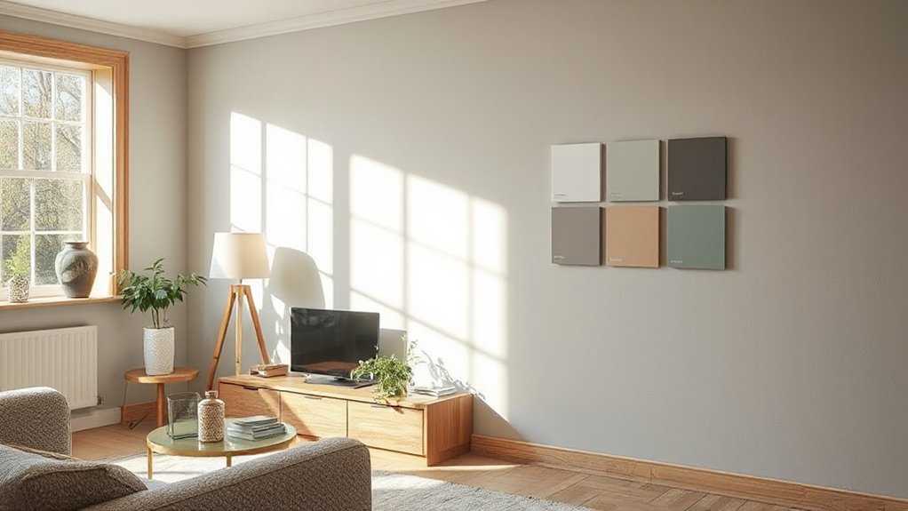
You’ll notice how subtle sheen can elevate a room without shouting. A durable paint texture maintains color integrity while resisting wear, keeping walls looking precise year after year.
This combination—subtle sheen, durable texture, and lasting depth—creates spaces that feel refined and resilient.
Subtle Sheen Finishes
- Durable yet subtle: performance across rooms
- Bold accents, colour psychology: strategic use
- Maintenance-friendly, low-gloss elegance
Durable Paint Texture
Durable paint textures with a subtle sheen balance resilience and refinement, delivering a washable, low-maintenance finish that holds up under daily wear. You evaluate texture as a performance feature: a fine-to-medium grip that resists scuffing without sacrificing luminosity.
In practice, this translates to coatings engineered for higher scrub resistance, rapid cleanability, and minimal cracking under vibration or impact. You’ll distinguish interior vs exterior finishes by sheen level, film thickness, and substrate compatibility, ensuring the texture remains stable in varying humidity and temps.
Eco-friendly paint options are now compatible with durable textures, offering low-VOC formulas without compromising durability. When selecting, prioritize tint retention, film flexibility, and minimal chalking, so the texture maintains its subtle sheen and practical longevity across spaces.
Longevity And Depth
- Film integrity as a predictor of lasting depth
- Subtle sheen controlling perceived colour and light
- Historical influences shaping durable, balanced palettes
Hygge-Inspired Earth Tones for Warmth
Hygge-inspired earth tones create a calm, inviting backdrop by balancing warm browns, muted greens, and soft ochres with natural textures. You’ll find that this palette enhances perceived warmth without overheating spaces, enabling efficient thermal comfort and cohesive lighting behavior.
In practice, select foundational neutrals as the anchor, then layer with tactile materials—untreated wood, linen, and stone—to amplify depth and acoustics. Bold accent walls should be used sparingly to maintain legibility and avoid visual fatigue, ideally in controlled zones or alcoves to concentrate mood shifts without overpowering adjoining areas.
Vintage colour schemes can guide finish choices, pairing aged patinas with modern sheen to preserve timelessness while meeting contemporary performance standards. This approach supports flexible, durable interiors aligned with current UK home renovation priorities.
Living Rooms to Kitchens: Colour Stories by Room
From living rooms through to kitchens, color stories should align with each space’s function while preserving a cohesive journey through the home. You’ll map palettes to activity: social zones, cooking prep, and casual dining all benefit from deliberate contrasts and shared undertones.
In living rooms, introduce Vintage textures to add character without visual noise, pairing with muted base hues for longevity.
In kitchens, favor durable finishes and high-contrast accents that stay legible under lighting changes.
Cultural influences guide materials and motifs, ensuring regional authenticity without stereotypes.
Maintain continuity via a limited, repeatable neutrals core and deliberate pops that travel from room to room.
- Vintage textures anchor personality while remaining adaptable across spaces
- Cultural influences inform materials, patterns, and finishes
- Shared undertone, distinct room accents maintain cohesion
Small-Space Brighteners: Light-Reflecting Tones That Work
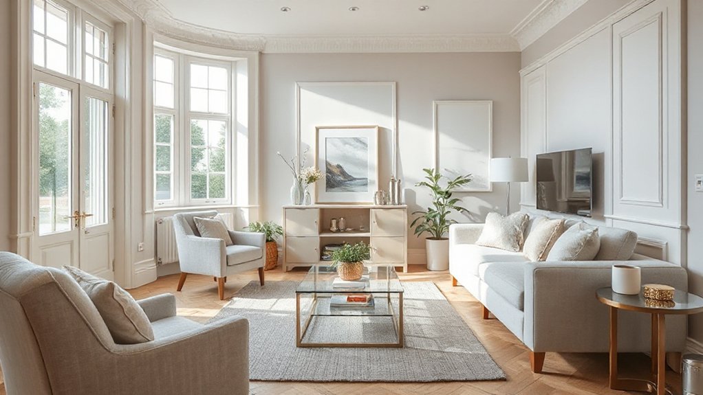
Small-space living benefits most from tones that bounce light and read as visually expansive. In compact rooms, you’ll prioritize light-reflecting paint finishes that amplify daylight and reduce perceived clutter, creating a calmer, more navigable environment.
Implement horizontal or vertical strategies with white or off-white bases, then introduce subtle colour psychology cues to guide mood without overpowering scale. You should select a paint finish that balances sheen and touch: satin or eggshell for walls, matt for ceilings, to maximize brightness while masking imperfections.
Consider cooler neutrals with gentle warm undertones to prevent sterile atmospheres. Use reflective accents sparingly—gloss on trims or cabinetry can sharpen light pathways.
This approach yields perceptual expansion, improved daylight distribution, and a coherent, restrained palette across adjoining spaces.
Exterior Palettes That Tie to the Garden
- Align exterior and interior color logic for seamless shifts
- Use furniture coordination to reflect garden textures and hues
- Select durable materials that mirror outdoor surfaces and endure seasonal variation
Layer Your Colors Without Overwhelming a Space
Layered colour combinations create texture without bulk, letting you establish depth through measured contrasts.
Use balanced hue pairings to keep rooms harmonious while still reading as intentional, not crowded.
Apply the accent-then-rest method to spotlight focal points before expanding to broader areas.
This approach keeps the space cohesive, precise, and visually breathable while guiding colour hierarchy across surfaces.
Layered Colour Combinations
- Use a unified undertone across layers to maintain harmony
- Apply with consistent brush/roller technique and minimal overlapping
- Schedule multiple thin coats and targeted glazing for depth without contrast spikes
Balanced Hue Pairings
In practice, complementary colour schemes offer dynamic contrast without overstating any single element, as balanced saturation prevents jarring shifts when accents appear. Simultaneously, monochromatic harmony provides depth through subtle variations of a single base color, ensuring cohesion across walls, furniture, and textiles.
Precision is key: calibrate lightness levels so brighter pieces don’t overpower dimmer ones, and limit high-saturation items to focal points. This approach supports visual rhythm, reduces fatigue, and sustains a refined, professionally coordinated ambience throughout the home.
Accent-Then Rest Method
Accent-Then Rest builds on balanced hue pairings by guiding you to deploy a bold accent first, then calm the palette with restful, supporting tones. You leverage colour psychology to anchor a focal point while the surrounding shades temper intensity, ensuring legibility and mood cohesion.
This method reflects historical influences in how traditional palettes emphasize accent landmarks within rooms, yet it adapts to modern light dynamics and material textures. You deploy the accent deliberately, then layer rest tones to create depth without visual saturation.
The result is a coherent, breathable environment where contrast serves function, not shock.
- Define the bold accent as the visual anchor, not the sole feature
- Choose rest tones that sustain clarity across lighting conditions
- Test with samples under typical daylight and artificial light scenarios
Test, Refine, and Decide: Practical Palette Testing Tips

To test, refine, and decide on palette choices effectively, start with controlled swatches in real rooms and under varied lighting conditions. You’ll compare hue, value, and chroma as they shift with daylight, LEDs, and ambient surfaces.
Build a testing grid: large swatches on wall patches, then scaled panels to simulate furniture and textiles. Record observations with a quick log: note temperature shifts, surface reflectance, and color stability over time.
Use color psychology to anticipate mood outcomes in each space, aligning palettes with function and occupant perception.
Apply paint application techniques consistently—back-roll for even coats, true-edge feathering, and uniform sheen.
Refine choices by narrowing to two finalists, then reconfirm under evening light. Conclude confidently, mindful of long-term durability and room purpose.
Budget-Smart Swaps: High-Impact Pairs Under £50 Per Tin
If you’re aiming for high-impact room updates without breaking the bank, focus on budget-smart swaps that pair well in cohesion and contrast, all under £50 per tin. You’ll maximize effect by selecting complementary tones that reinforce color psychology goals while maintaining practical paint application techniques.
This approach prioritizes coordinated palettes, crisp edges, and efficient coverage, delivering professional-looking results without premium costs.
- Pair a deep accent with a light midtone to amplify depth and mood.
- Use a warm neutral base and a cool pop for visual balance and perceived space.
- Opt for satin or eggshell finishes on high-touch walls to enhance durability and washability without inflating cost.
Results hinge on precise brushing, consistent roller technique, and proper sample testing to confirm hue behavior under lighting.
Frequently Asked Questions
How Do I Choose a Palette That Suits My Lighting?
Match your palette to lighting by testing color samples under each light. Consider color psychology and paint finishes; cool lighting enhances blues, warm lighting boosts creams. Opt satins or eggshells for subtle shifts; avoid flat finishes under glare.
Which Undertones Are Best for Warm Neutrals?
Complementary undertones pair best with warm neutrals, guiding depth and harmony. You’ll notice subtle shifts when lighting changes; neutral undertones stabilize the palette, while complementary ones energize accents, yielding balanced contrast across rooms.
Can Small Spaces Benefit From Dark Accent Walls?
Yes, you can; small spaces benefit from dark accent walls when used sparingly. Color psychology notes that contrast sharpens focus, while strategic light reflection maintains depth without overwhelming. Use trim and lighting to balance, not overpower.
How Many Colors Should I Use per Room?
Most designers recommend 2–4 colors per room. You should start with one dominant hue, add an accent wall idea, and use a trim color for contrast. This aligns with color psychology benefits and keeps spaces cohesive and balanced.
What Budget-Friendly Tools Help Test Colors Quickly?
You can test colors quickly with budget-friendly tools like peel-and-stick swatches and color-matching apps. Color psychology guides your choices, while paint finishing options affect sheen and perception, helping you assess mood and durability in real-time.
Conclusion
You’ve mapped your palette with precision, aligning trends to your space and lifestyle. By layering warm neutrals with deep accents, you’ll achieve depth without heaviness, and nature-inspired greens or blues bring calm that feels both timeless and modern. Durable finishes and subtle sheen guarantee longevity, while exterior palettes harmonize with your garden’s cadence. Test and refine methodically, you’ll avoid missteps and maximize impact. In short, your palette isn’t merely chosen—it’s engineered to endure and enchant, a technical triumph. Incredible.