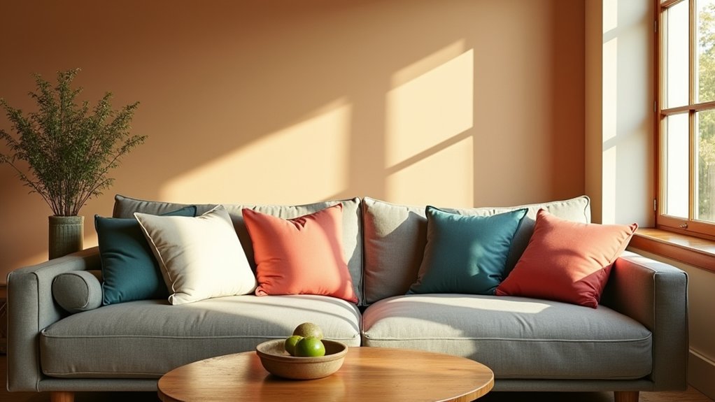
Choosing colors you can live with starts with how the light hits your space and how you feel in it. You’ll balance warm and cool tones, test swatches under different conditions, and aim for a timeless, versatile palette that suits the room’s purpose. Keep it durable, welcoming, and adaptable to daily life. The right approach keeps you moving forward, but there’s more to learn before you commit. Let’s map your path to a color strategy that fits now and grows with you.
Decode Color Reading for Your Space: A Step-by-Step Guide
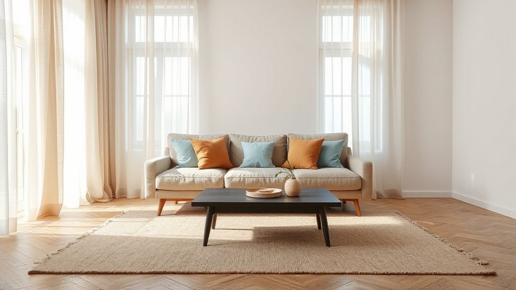
Color can transform a space, so start by reading the room’s mood. You’ll decode color reading by noting light levels, existing furniture, and how you feel in the space.
Begin with a quick assessment: what mood do you want—calm, energized, focused, welcoming? Use color psychology to map feelings to tones, then identify complementary hues to pair for balance.
Don’t chase trends; test swatches on wall at different times of day and in varied lighting. Sketch a simple palette from one dominant color plus two accents.
Consider contrast for readability and flow between rooms. Record observations and preferred outcomes, then refine until the palette supports function and comfort.
This method keeps choices intentional, practical, and aligned with how you actually use the space.
A Practical Method to Balance Warm and Cool Tones
To balance warm and cool tones effectively, start with a simple framework: choose one dominant vibe and adjust with two supporting accents. You’ll create color harmony by anchoring the room in a primary temperature and letting two deliberate accents shift the feel.
Begin with a dominant warm or cool base, then introduce a cool or warm companion to tip the tonal balance without clashing. Choose one accent color for textiles and another for décor details, keeping each under 15% of the palette.
Test under different lighting to confirm perceived balance. Use value contrast, not saturation, to prevent overstimulation. Document your palette and apply it consistently across surfaces.
This method yields cohesive rooms you love, avoiding trendy volatility while preserving flexible, timeless appeal.
From Color Trends to Timeless Palettes: Reading Color Futures
As trends shift, you’ll learn to translate fleeting color forecasts into enduring palettes that withstand seasons. Reading color futures means balancing excitement with restraint, predicting long‑term appeal rather than chasing every fad.
You’ll ground choices in color psychology and Cultural influences, ensuring moods align with spaces and audiences. Prioritize versatility: neutrals that adapt, accents with purposeful contrast, and textures that shift perception over time.
Develop a palette logic that survives merchandising or décor updates, not just a single trend cycle. Use futures insights to test combinations for harmony, readability, and accessibility. Then lock in a core set you can live with now and refine later.
- A soft, adaptable neutral that grounds bold accents
- An accent color tied to cultural storytelling
- A texture-driven contrast that stays intriguing
- A breathable, legible interface-friendly pairings
Test, Tweak, and Lock In Palettes That Actually Work
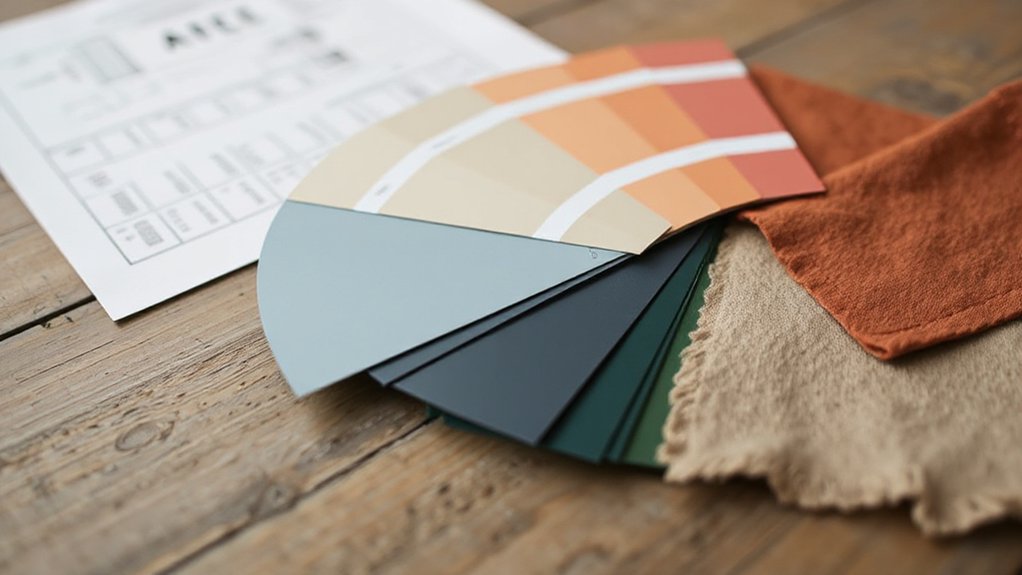
Start by testing your palette in real contexts: mock up scenes, screens, and product materials to see how colors perform under different lighting and scales.
Then collect feedback from actual use: note legibility, contrast, and mood across devices.
Tweak hues, saturation, and relationships so the palette supports a consistent experience, not just pretty swatches.
Lock in rules for hierarchy, accessibility, and revival when needed, so a single color doesn’t dominate or clash.
Consider color psychology and emotional impact as you adjust: what feeling does each shade evoke under typical conditions?
Streamline your selections into a small, practical system: primary, secondary, accents, and neutrals, with clear usage notes.
Finally, validate with real content prototypes, ensuring the set remains effective across contexts before committing.
Five Everyday Rules Your Color Can Live With
Color your palette with durable pairings that stick, and keep your options open with lighting that adapts without breaking the look.
Build habits around color schemes that hold up under different illuminants and angles, so you don’t have to redo guesses.
These everyday rules help you stay practical: choose combinations that retain impact across scenes and sources, and test them under varied lighting before you commit.
Durable Color Pairings
- Anchor neutral with a bold accent for lasting contrast
- Favor classic undertones over fleeting trends
- Select high-durability finishes for daily life
- Reuse a single color family across spaces
Flexible Lighting Compatibility
Lighting changes can alter color perception, so pick hues that stay true under daylight, LED, and incandescent lighting. Flexible lighting compatibility means your color choices should perform well across common scenarios, from living rooms to work areas.
Favor balanced undertones and avoid extremes that shift with bulbs or wall finishes. Consider ambient harmony: how the color interacts with surrounding surfaces and light sources to create a cohesive feel.
In practice, test swatches under different luminances and temperatures, then rely on a single family of shades rather than multiple, jarring accents. This supports steady color psychology—comforting, energizing, or calming—depending on intent.
Your goal is consistency, versatility, and mood control, so your palette stays credible as lighting evolves.
Create Your Personal Color Compass for Future Growth
To grow, you need a clear map—so create your personal color compass that guides choices, tracks progress, and aligns with your goals. Your compass blends Color psychology with practical benchmarks, ensuring every hue supports growth and consistency.
Use it to evaluate new palettes, retire outdated combos, and measure emotional impact over time. Build the framework around four core axes: intention, harmony, contrast, and adaptability. Regularly revise as goals shift, and keep a simple log to visualize trends.
- A intentional palette that mirrors your evolving ambitions
- Harmony rules that keep colors cohesive across contexts
- Contrast checks to preserve readability and emphasis
- Adaptability notes for seasonal or project-driven changes
Frequently Asked Questions
How Do I Choose Colors for a Small Room Without Feeling Boxed?
To avoid feeling boxed in, choose colors that expand space and reflect you. Use light neutrals as a base, add brighter accents for depth, and keep patterns subtle.
Apply color psychology by pairing cool tones with warm accents to balance mood and perceived size.
Emphasize natural light, use reflective surfaces, and layer textures.
Consider emotional impact: calm walls, energizing trims, and a focal color that ties furniture together for cohesion and openness.
Can I Mix Bold Colors With Neutrals Without Chaos?
Yes, you can mix bold colors with neutrals without chaos. Start with a neutral base and add one bold accent palette; use color theory to choose harmonious pairs (complementary or analogous schemes).
Keep patterns sparse and repeat a single bold hue across accessories for cohesion. Consider color psychology: calmer neutrals balance energized accents.
Test swatches in natural light, then refine until you feel deliberate, not overwhelmed. You’ll achieve a purposeful, lively space you won’t tire of.
What About Color Personality, Not Just Aesthetics?
Color psychology goes beyond looks; it taps into personality traits. You’ll pick colors that reflect who you’re and influence mood, behavior, and space use.
If you’re bold, you’ll lean into vivid accents and story-driven palettes. If you’re calm, you’ll favor muted tones that project stability.
You’ll test how different shades affect you daily, then adjust.
In practice, match furniture, lighting, and art to reinforce your chosen personality traits.
How Do Lighting Changes Affect Color Perception Over Time?
Did you know 90% of shoppers perceive product colors differently under varying lighting? Lighting changes alter color perception over time, especially as color temperature shifts and natural light morphs through the day.
You’ll notice colors warm up under warm color temperature and cool down with daylight. Track the impact by comparing swatches at different times, use standardized lighting, and account for natural light’s trajectory to keep colors consistent as it evolves.
Are There Color Choices That Boost Mood Long-Term?
Yes, certain color choices boost mood long-term. Color psychology suggests using soft blues for calm, warm yellows for optimism, and greens for balance.
Keep contrasts low to avoid fatigue, and repeat a few favorite hues to reinforce emotional impact.
Combine saturation with natural light, and anchor rooms with neutrals to prevent overstimulation.
You’ll notice consistent mood benefits as you create predictable, comforting environments.
Conclusion
You’ll finish with a palette that feels inevitable, like a familiar street you’ve walked a hundred times. Trust the method: read light, test swatches, balance warmth and cool, and lock in what actually works. Think of your colors as quiet advisors—subtle, present, dependable. As with any lasting choice, they echo familiar comforts while inviting growth. Follow this compass, and your space will age gracefully, always ready for the next moment you’ll confidently live in it.