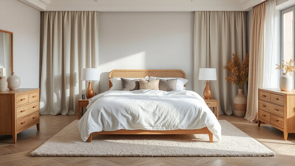
Create a calming beige-and-grey bedroom by pairing warm neutrals with cool accents for balance. Layer textures like wool throws, linen quilts, and boucle cushions to add warmth without shifting color. Choose low-profile furniture to preserve sightlines and arrange beds and lighting for serene symmetry. Diffuse natural light with sheer linen curtains and layered blackout panels, keeping hardware unobtrusive. Finish with subtle patterns, muted metals, and warm woods for cohesion—and if you keep going, you’ll uncover more serenity-enhancing details.
Define Your Calm Beige-and-Grey Palette

Choosing a calm beige-and-grey palette starts with intent: pick a base of warm beige and cool grey that harmonize rather than compete. You’ll establish a mood first, then layer accents that reinforce it.
Start with a primary surface: walls in a soft beige or a cool grey, depending on natural light. Pair with a darker accent for depth, but keep contrast limited to avoid disruption.
Choose furniture in neutrals that echo the base tones, ensuring beige and grey tones blend rather than clash. Introduce textures through textiles and finishes rather than bold color shifts.
For calming color schemes, limit the palette to two to three core tones and one unifying accent. Keep hardware and decor simple, purposeful, and aligned with your chosen beige and grey tones.
Layer Textures for Warmth
Layer textures add warmth without altering the color base. You can layer textiles and surfaces to achieve depth while preserving the calm palette.
Start with a soft wool throw or linen quilt in beige or light gray, then add a boucle or velvet cushion for subtle textural variation.
Mix woven headboard accents with a matte ceramic lamp and a cotton rug to create contrast between surfaces and fibers.
Keep the tone cohesive by repeating a few neutral textures in varied scales.
Introduce subtle sheen, such as a satin pillow edge or jacquard weave, to catch light without overpowering.
Plan Furnishings and Layout for Serene Flow
With a calm palette established, plan your furnishings and layout to support serene flow. Start by choosing a low-profile bed and minimal dressers to keep sightlines open. Place the bed so it faces a calm focal point, such as a window or area rug, not a doorway.
Balance the room with symmetric nightstands and soft, textural bedding to reinforce cohesion. Select decorative wall art sparingly, using two or three pieces in complementary tones to avoid visual clutter.
Keep traffic paths clear by spacing furniture to form gentle, unobstructed routes. Incorporate ceiling lighting fixtures and layered illumination—ambient, task, and accent—without overpowering the space.
Avoid heavy, dark contrasts; lean toward subtle, cohesive accents for a tranquil, cohesive atmosphere.
Diffuse Light With Soft Window Treatments
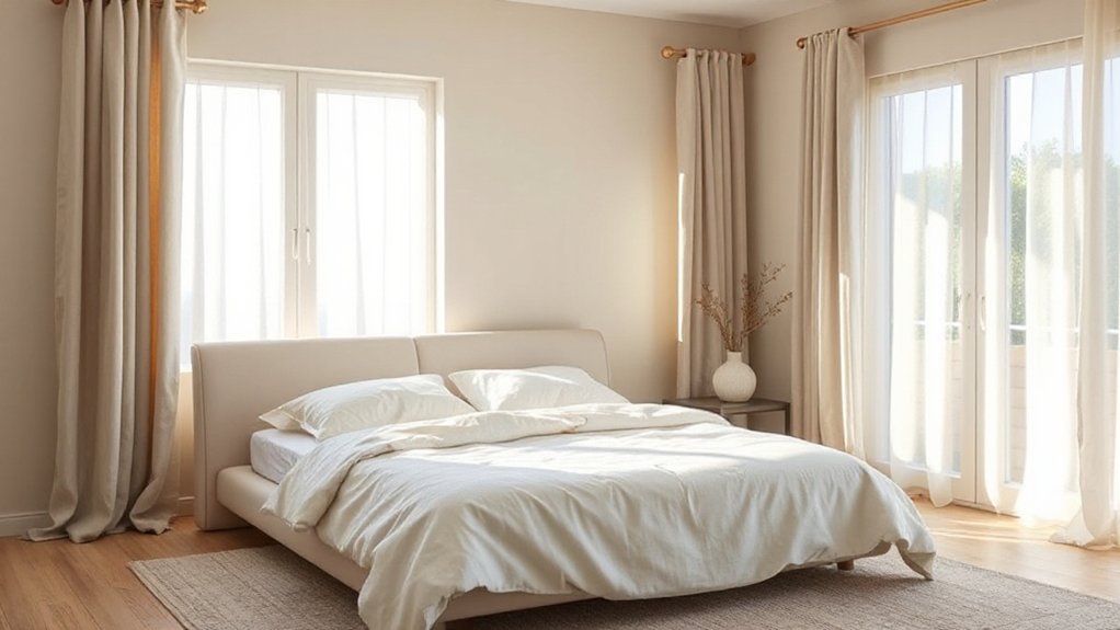
Soft window treatments softly filter natural light, creating a warm, inviting glow without glare. You’ll enhance calm by choosing fabrics like linen or sheer blends that diffuse light evenly across walls.
Opt for neutral shades in beige or warm greys to maintain a cohesive palette and avoid harsh contrasts. Keep hardware simple and unobtrusive to preserve an uncluttered look, and consider motorized options for easy daily adjustments.
Layering treatments—sheers beneath blackout panels—lets you control intensity while preserving privacy. When selecting soft window treatments, prioritize fiber durability and washability, since frequent adjustments are common in a serene bedroom.
Choose Subtle Accents and Patterns
Subtle accents and patterns quietly elevate a calming beige and grey palette without overpowering it. You choose restrained details to maintain serenity while adding visual interest.
Focus on texture over loud color: a linen headboard, a soft wool rug, or a tactile throw offer depth without distraction. Incorporate artful wallpaper in a muted, organic motif to create subtle rhythm, avoiding dominant prints.
Pair this with understated bedside lamps and slim metallic accents to introduce a gentle sheen. Patterns should repeat softly, like a tonal chevron or fine pinstripe, ensuring consistency across textiles and accessories.
Reserve bold patterns for strategic focal points—perhaps a single accent pillow or a framed textile—instead of large surfaces. The result stays cohesive, refined, and quietly inviting.
Finalize With Color and Metallic Touches
You’ll balance metallic accents with soft linen textures to keep the space inviting rather than stark. Introduce warm tones that harmonize with beige and grey, letting metallic touches add subtle shine.
Keep the look precise and purposeful, so every element supports calm, cohesive comfort.
Metallic Accents Balance
Metallic accents should balance color and texture without overpowering calming beige and grey. In this phase, you’ll weave metallic touches into a restrained palette, letting them highlight rather than dominate.
Choose finishes—matte nickel, brushed brass, or antiqued bronze—that echo your wall hues and bedding tones. Place metallics as small focal points, such as a lamp, picture frame, or hardware, to create subtle shimmer without glare.
Pair these with other calm elements to sustain a cohesive look. When you introduce metallic accents, ensure they harmonize with calming color schemes by reflecting soft light and reinforcing serenity.
Avoid busy patterns near reflective surfaces, and maintain clean lines to preserve the tranquil mood while adding depth and interest.
Soft Linen Textures
Soft linen textures anchor the calm beige and grey palette by introducing tactile depth that remains understated. You’ll notice linen bedding lending a breathable, slightly textured surface that still reads refined rather than rustic. Pair it with soft throw pillows to create gentle layers without visual noise.
The natural wrinkles add casual elegance, so you don’t need perfect surfaces to achieve a polished look. Keep color consistent, favoring sand, oatmeal, and stone to maintain harmony with the base tones. A light, creamy throw at the foot of the bed reinforces the soft, airy feel while staying versatile for future accents.
Finish with subtle metallic touches—nicked brass or brushed nickel—to elevate texture without overpowering the serene, neutral scheme.
Warm Tone Harmonies
To finish the look, introduce warm tones that glow against the cool beige and grey base. You’ll balance neutrals with color depth by layering warm fabrics and metallic accents.
Choose a light caramel or taupe palette for rugs and throws to create subtle contrast without overpowering the calm foundation. Pair this with warm woods or brass elements in lamps and furniture to enhance depth and sophistication.
Integrate luxury bedding in satin or velvet textures to elevate tactility while keeping the palette cohesive. Use statement artwork with amber, terracotta, or gold highlights to anchor the room and reflect light.
Finish with soft lighting and minimal clutter to preserve serenity.
Frequently Asked Questions
How Can I Hide Clutter Without Disrupting the Calm Palette?
Use smart storage solutions and decorative baskets to hide clutter without breaking the calm palette. Choose woven or matte-finish baskets, tuck them on shelves or under beds, and opt for labeled, cohesive containers for a tidy, serene look.
What Lighting Color Temperature Suits a Beige-And-Grey Scheme?
About 2700K to 3000K is ideal, you’ll create warm, inviting vibes. You’ll notice 80% of homeowners prefer this range for beige-gray rooms. Use lighting fixtures with adjustable color temperature to suit tasks and moods.
Which Ceiling Treatments Complement a Serene Bedroom Look?
Ceiling texture options that suit a serene look include soft popcorn and delicate stipple finishes, plus smooth plaster. Combine decorative ceiling moldings sparingly to add character without overcomplicating the calm aesthetic.
How Do I Mix Matte and Glossy Finishes Subtly?
You can achieve matte glossy contrast by using finish blending techniques: stick to a limited palette, apply subtle sheen changes on furniture and hardware, and keep lighting even to avoid glare while maintaining a refined, professional look.
Can I Use Color-Safe Plants Without Overpowering Neutrality?
Yes, you can: place color-safe plants thoughtfully to maintain neutrality. Focus on Plant placement for discreet pops, and use subtle Color contrast through foliage height, texture, and container tones to avoid overpowering the calm palette.
Conclusion
A calm beige-and-grey bedroom rests on restraint, not blandness. You’ll feel space expand as textures mingle and light softens, inviting restful rituals. When one client shared a 20-minute nightly declutter, stress dropped noticeably—proof that simplicity improves sleep. Remember: the palette sets the mood, while layout and textiles maintain it. Stick to subtle patterns, gentle metals, and soft drapery; let increased serenity be your cue to linger in the room you’ve refined. Your sanctuary, quietly refined and endlessly calming.