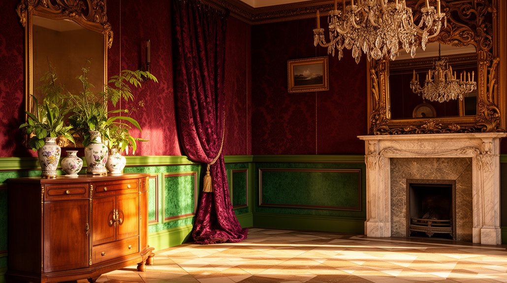
You’ll want to ground your scheme in authentic Victorian hues drawn from mineral and plant sources, then layer them across walls, trims, and textures to reveal depth without overwhelm. Balance rich colors with careful lighting, plaster or wallpaper textures, and precise surface prep to keep the period’s integrity intact. The result is measured drama you can live with, but the most telling decisions still lie just beyond your first pass—where your palette meets the room’s scale and mood.
What Makes Victorian Colors Tick
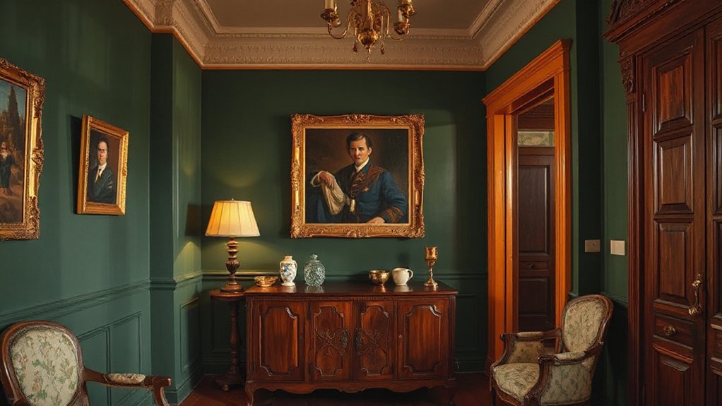
Victorian colors aren’t arbitrary trends; they’re the result of a deliberate mix of pigments, social signals, and practical constraints. You’ll notice the palette derives from accessible mineral and plant sources, with fuchsias and ochres refined through trade routes and pigment purity.
Victorian symbolism isn’t merely decorative; it encodes status, mood, and meaning, guiding choices in parlors, libraries,, and dining rooms. You understand that hue selection communicates intention—wealth, education, morality, or refinement—often anchored to seasonal availability and aging properties of finishes.
Historical significance appears in the way light interacts with plaster, wood, and wallpaper, shaping perception and memory. This knowledge helps you curate rooms with purposeful color logic, ensuring your scheme reflects authentic period vocabulary while preserving modern livability.
Build Your Color Plan: Selecting Hues
Ready to translate color theory into a practical plan? You’ll build a disciplined palette by defining purpose, mood, and period accuracy. Begin with core neutrals as anchors, then layer accent hues drawn from Victorian palettes, artworks, and textiles to achieve Historical accuracy.
Map hues to rooms and functions, ensuring daylight variations are accounted for so color reads consistently. Evaluate Cultural influences—regional textures, craft traditions, and chroma associations—to guide tone choices that feel authentic rather than anachronistic.
Establish a hierarchy: dominant walls, secondary trim, and strategic pops that reinforce architectural features. Create a small, swatch-driven board to compare hues under natural and artificial light.
Finally, document your selections with notes on provenance, finish, and daily living practicality to sustain clarity and confidence throughout your project.
Finishes and Textures That Deepen the Drama
You’ll introduce depth to your Victorian scheme with rich texture layers and bold finish techniques that draw the eye. Start by pairing matte walls with lightly lacquered accents to create controlled drama.
Then layer tactile finishes that invite touch and reflection. This approach keeps the atmosphere refined, credible, and visually compelling.
Rich Texture Layers
Texture is the key to deepening drama in Victorian interiors, because layered finishes create richness that paint alone can’t achieve. You’ll curate texture through deliberate materials, sheens, and tactile surfaces that communicate history while guiding light and mood.
Use subtle textural contrasts—matte walls with a satin trim, tactile plaster, or linen-backed wallpapers—to heighten nuance without overwhelming the palette. Introduce pattern integration through restrained motifs in textiles, upholstery, and drapery that echo architectural details.
Balance rugged textures with refined ones to maintain a cohesive refined atmosphere. Consider natural fibers, clay, and limewash to add depth without depth overload. The goal is dimensionality that reads as intentional, not busy, ensuring each layer reinforces the colour story with quiet, controlled confidence.
Dramatic Finish Techniques
Rich, dramatic finishes push texture beyond the surface, turning color into a tactile experience that amplifies Victorian character. In this section, you’ll apply controlled technique to elevate rooms with purpose.
Start with Textured wall finishes that add depth without overwhelming ornament, selecting plaster, lime, or faux stucco textures calibrated to room scale. Pair these with color palettes that emphasize shadows and highlights, ensuring contrast remains deliberate, not chaotic.
Next, practice Metallic accent techniques to introduce reflective warmth, using restrained applications on moldings, panels, or feature alcoves. Keep metalwork understated to preserve historical integrity while enhancing mood.
Document your process, test samples, and compare before committing. The result is a curated balance of texture and sheen that deepens drama while preserving Victorian clarity and provenance.
Room-by-Room Pairings for Livable Victorian Drama
In Victorian interiors, room-by-room pairings balance drama with daily livability, pairing bold color blocks with calmer neutrals to guide the eye and calm the space. You’ll anchor living rooms with deep, assertive wall tones at key focal walls, then soften adjacent areas with lighter trims and upholstery to sustain continuity.
Hallways and libraries profit from controlled contrasts: a single saturated accent door or shelf balance against cream or greige backdrops, reinforcing rhythm without visual fatigue.
Bedrooms benefit from restrained palettes that still read stately, using layered textures to convey depth.
Kitchen and dining zones can carry Victorian color symbolism through carefully chosen cabinetry hardware and tile glimpses, while maintaining practical, wipeable surfaces.
Historical palette influences should inform your choices, ensuring authenticity and timeless coherence.
Light, Scale, and Layering to Avoid Overwhelm
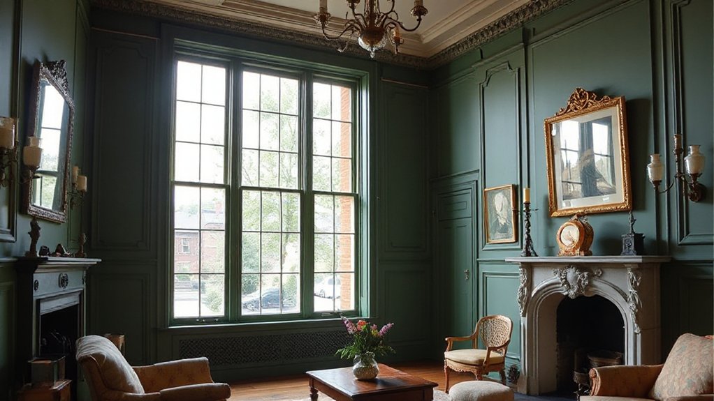
You’ll balance light by using strategic white or neutral ceilings and reflective surfaces to prevent your space from shrinking under rich hues.
Layered scale means mixing large, airy elements with smaller details so rooms feel cohesive rather than crowded.
Prioritize subtle shifts and controlled contrasts to guide the eye without creating overwhelm.
Light Balance Techniques
To avoid overwhelm in Victorian interiors, balance light, scale, and layering with intention: mix natural daylight, warm artificial glow, and thoughtful dimming so spaces feel cohesive rather than cluttered.
- Use daylight to reveal color harmony, avoiding harsh contrasts that disrupt mood.
- Layer lighting sources: ceiling, task, and ambient lamps, tuned to a unified warmth.
- Control scale with luminance, pairing large surfaces with gentle illumination for breathing room.
- Employ dimmers to modulate intensity as activities shift, preserving depth without glare.
This approach preserves a curated ambiance, ensuring rich heritage palettes read as cohesive. You’ll maintain precision in tone, trust in tested compositions, and prevent visual fatigue.
For authenticity, align fixtures and finishes with period sensibility while optimizing natural light to enhance color harmony throughout the room.
Layered Scale Strategies
When layering light, scale, and texture, start with a clear hierarchy that guides the eye without shouting. You pair large, muted surfaces with mid-sized accents to establish a calm rhythm, then add small details for focal interest.
Use color psychology to select hues that modulate mood—richs for warmth, cooler neutrals for balance—while keeping vivid tones restrained in accessories.
Maintain historical accuracy by aligning fixture finishes and wallpapers with period cues in scale and proportion, not novelty. Establish contrast through matte and satin finishes rather than loud color shifts, ensuring readability across rooms.
Layer textiles, architectural hardware, and art at progressively smaller scales to prevent visual fatigue.
In practice, test combinations under natural light, then refine until the room feels cohesive, intentional, and timeless.
Practical Application: Prep, Apply, Maintain
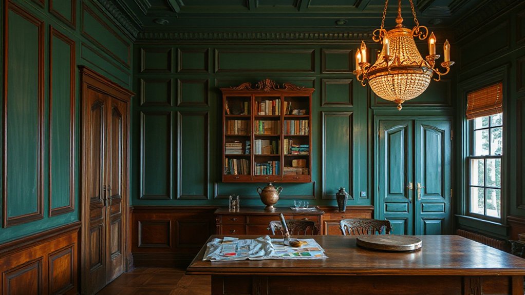
Begin by prepping the room meticulously: clear the space, remove or cover furniture, and seal surfaces to prevent splatter.
You’ll apply with methodical precision to honor Color psychology and historical accuracy. Follow a disciplined sequence—prep, prime, paint, maintain—and document outcomes for consistency.
- Protect edges with painter’s tape and drop cloths, then prime surfaces for uniform adhesion.
- Cut in first on trim and corners, then roll large planes for even coverage.
- Maintain steady, overlapping strokes to avoid lap marks and color fiber pull.
- Clean brushes and rollers promptly; store paint in labeled, airtight containers.
Maintain results by ventilating, wiping smudges promptly, and inspecting for wear.
This disciplined routine preserves depth, tone, and era-appropriate nuance.
Frequently Asked Questions
How to Choose Historical Pigments Without Modern Imitations?
To guarantee you avoid modern imitations, verify Historical accuracy by consulting period reference manuals and museum catalogs.
Insist on pigment sourcing details from suppliers. Ask for documented batch notes, botanical or mineral origins, and sun-fast tests.
You should request fugitive color tests, historical binder compatibility, and archival pigment codes.
Prefer certified restorers with provenance records.
This disciplined approach guarantees you maintain authenticity while curating a durable, historically faithful palette.
Which Rooms Benefit Most From Victorian Color Saturation?
One striking stat: rooms with saturated Victorian hues report feel 20% more intimate. You’ll notice which spaces benefit most from Victorian color saturation: reception rooms, libraries, and dining halls.
You center attention with Victorian color symbolism to convey status and warmth, while Historical color palettes guide your choices.
You articulate credibility by pairing bold accents with muted walls, balanced by controlled lighting.
You’ll craft curated, authoritative interiors that feel timeless and precisely put together.
How Do You Test Color Visibility in Varied Lighting?
To test color visibility in varied lighting, observe swatches at different times and with multiple light sources. Use direct, ambient, and evening lamps to compare how hues shift.
Rely on color psychology to gauge emotional impact under each glow, and document contrasts.
Employ lighting techniques like dimmers and daylight-full windows to reveal true saturation. You’ll adjust until tones stay consistent, ensuring your palette reads deliberately and remains credible across environments.
What Are Affordable Sources for Authentic-Era Paints?
Affordable sources for authentic-era paints include specialty restoration suppliers, online marketplaces that curate vintage formulas, local historic preservation groups, and hobbyist forums where owners trade leftover tins.
Seek pigments labeled Historical paint recipes and Vintage color palettes, and verify provenance before purchase.
You’ll save by buying discontinued hues in small lots or mixing kits, then test for compatibility with modern primers.
Approach each buy with discernment, and document mixing ratios for future touch‑ups.
How Can You Balance Bold Hues With Modern Furnishings?
You balance bold hues with modern furnishings by focusing on color palette coordination. Start with a neutral base, then introduce one dominant heritage color as the focal point.
Use subdued tones for large furniture and airy walls. Add contemporary accessory integration through metal and glass accents, minimal patterns, and clean lines.
Preserve contrast with texture, not flash. This disciplined approach ensures cohesion, sophistication, and a timeless feel in your Victorian-inspired spaces.
Conclusion
You’ll see the theory hold true: authentic Victorian colors amplify mood when you honor history with discipline. By selecting minerals-and-plant-derived hues, layering textures, and aligning light, scale, and finish, your spaces gain depth without feeling costumes-like. Prepare surfaces meticulously, apply with care, and maintain values over time to keep the drama grounded. When you trust historic palettes and modern technique, your interiors don’t just look period-correct—they feel timeless, crafted, and convincingly alive.