Exterior paint choices that boost kerb appeal start with a durable foundation color in low-contrast neutrals, then add contrast with trim and a focal door that pops. Match textures—wood, masonry, or metal—to the right primers and finishes, and pick a climate-smart palette designed to resist fading. Test swatches outdoors in different light to confirm undertones, and keep lighting and landscaping cohesive. If you keep exploring, you’ll uncover practical tweaks that elevate curb appeal even more.
What Kerb Appeal Means for Your Exterior and How to Measure It
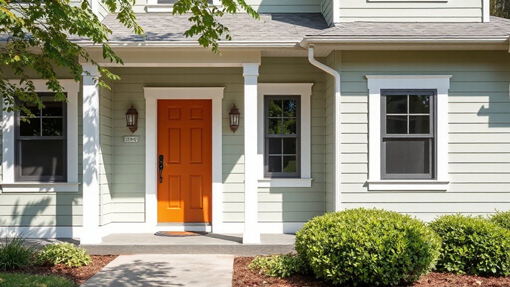
Kerb appeal is the first impression your home makes, so it’s about how your exterior looks from the street and the feelings it evokes. You measure it by observing line, proportion, and cohesion across paint, materials, landscape, and lighting.
Start at street level: do colors harmonize with architectural features, roofline, and windows without shouting? Then evaluate scale and balance—win points for symmetrical elements, thoughtful gaps, and clear sightlines to entrances.
Garden landscaping matters: tidy borders, healthy plantings, and deliberate focal points lift the street view.
Outdoor lighting matters too: warm, even illumination that enhances texture, safety, and curb presence after dark.
Use a simple checklist—color relationships, maintenance cues, and lighting quality—to quantify kerb appeal and guide your exterior paint choices.
Choose a Durable Foundation Color for Your Home’s Style
Your foundation color sets the tone for the whole house, so start with durable hues that resist fading and weathering. Choose base colors that respond to your home’s style—think earthier tones for traditional lines, or cooler neutrals for modern profiles—so your siding and trim stay cohesive as trends shift.
Consider how practical factors like roof color, landscaping, and durability ratings influence the long-term look and maintenance of your exterior.
Durable Foundation Hues
Choosing a durable foundation color sets the tone for your home’s style while standing up to weather and daily wear; pick a shade with real practicality in mind. Your foundation hue should anchor the exterior palette, not shout over architectural details.
Opt for low-contrast grounds that hide dirt and weathering, yet read as intentional anchors for the overall scheme. Consider soft charcoals, warm taupes, or processed-neutrals that pair well with brick, stone, and siding accents.
Test swatches at different times of day to reveal true undertones. Balance with durable primers and topcoats to maximize fade resistance.
Integrate garden fixtures and porch designs into the landscape plan, ensuring progression feels cohesive rather than episodic. Prioritize a finish and hue that endure seasonal shifts and everyday activity.
Style-Responsive Base Colors
Use color psychology to pick tones that evoke the desired mood—calm, stately, or welcoming—without overpowering features or landscaping. Historical influences matter too: doors, shutters, and parapets can echo period details while you remain modern in finish and durability.
Prioritize breathable, fade-resistant finishes and consider subtle saturations that enhance texture—brick, stone, or siding—without betraying your home’s character. Test chips at multiple times of day, then confirm with a small, cohesive palette that supports curb appeal and longevity.
Pick Trim, Doors, and Accents That Pop
To make trim, doors, and accents really pop, choose contrast that complements your siding and roof while reflecting your home’s character. You’ll steer this with practical, trend-aware choices that sharpen curb appeal without overcomplicating your palette.
Begin by identifying your home’s architectural cues—heritage, modern, or eclectic—and pick trim colors that emphasize those lines. Use Color psychology to select hues that evoke warmth for welcoming entrances or crispness for contemporary exteriors.
Consider doors as focal points: a bold front door can anchor the scheme, while complementary side lights keep balance. Historical color trends offer reliable guidance, showing when to revive classic tones or modernize with refreshed neutrals.
Test samples on small panels, observe in different lights, and guarantee consistent saturation across trim and accents.
How Texture and Material Affect Paint Choice
Texture and material shape how paint behaves and how your finish looks, so start by matching paint type to the surface you’re covering. You’ll note that textured finishes grip different paints than smooth surfaces, so pick formulas that enhance texture rather than obscure it.
For wood, masonry, or fiber cement, follow manufacturer guidance on adhesion and flexibility; high-build primers can reduce grain show-through and even out porosity.
For metal, use rust-inhibitive primers and enamel or polyurethane-topcoats that resist chipping.
When you evaluate material compatibility, consider porosity, movement, and heat exposure, then choose a sheen that aligns with traffic and maintenance.
In short, texture drives product choices, and surface compatibility guarantees durability, color stability, and a cohesive curb appeal.
Climate-Ready Palettes: Adapting Color to Weather and Sun
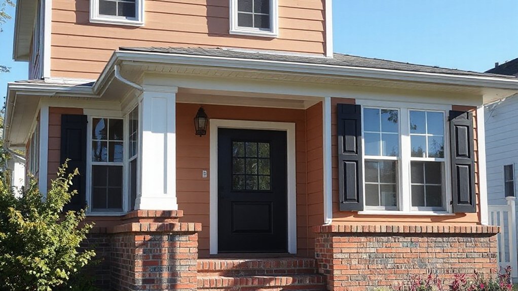
Climate drives color choices just as much as material and finish, so you’ll want palettes that perform under sun, wind, and seasonal shifts. You’ll prioritize colors that resist fading, manage heat gain, and preserve curb appeal over time.
Climate-appropriate palettes combine practical primers and mid-range tones that reflect rather than trap heat, keeping exteriors comfortable and looking cohesive. Consider color psychology to select hues that convey calm or energy without overdoing contrast in bright sun.
For durability, test boards under varying light and catalog, over seasons, to confirm consistency. Historical palettes offer proven reliability, informing modern combinations with timeless appeal.
Adaptability shines in layered neutrals and restrained accents, ensuring your home remains stylish as weather patterns evolve.
Classic Color Combos vs. Bold Accent Strategies
Classic color combos create a timeless, harmonious base, letting your home’s architecture shine without shouting. But a bold accent—think door trim, shutters, or a striking front door—adds personality and modern edge without overhauling the palette.
You’ll weigh whether you want quiet consistency or a focal pop that catches the eye and guides first impressions.
Classic Harmony Or Contrast
When choosing exterior colors, you’ll decide between classic harmony and bold accent strategies based on your home’s architecture, neighborhood vibe, and how you want it to read from the street.
Classic harmony relies on cohesive, understated combinations that emphasize architectural lines without competing cues. You’ll lean on color psychology to evoke calm, trust, and durability, often selecting timeless, historical palettes that age gracefully.
If your goal is seamless curb appeal, choose low-contrast pairings that highlight texture and massing rather than individual features.
Bold Accent Impact
Bold accents can transform an exterior color plan from quiet to provocative, especially when you stage contrast with intention rather than noise. You’ll balance classic color combos against bold accent strategies by testing saturation, hue temperature, and architectural cues. Color psychology guides where an accent roots emotion, while historical color trends inform how it ages on the facade.
- Align accents with door, trim, or shutters for cohesive emphasis
- Choose one standout hue, then anchor with two neutral supports
- Consider the surrounding landscape and neighborhood palettes
- Preview on sample boards at different lighting to avoid misfires
This approach keeps your curb appeal modern, deliberate, and enduring, not gimmicky.
Finishes and Sheens: Balancing Look and Maintenance
Choosing the right finish and sheen is about balancing appearance with upkeep, so you get the look you want without complicating maintenance. The key is matching sheen to traffic, exposure, and cleaning needs.
In this section, you’ll weigh finish options that hold up under sun, rain, and daily contact, while still delivering curb appeal. Consider satin for durable, approachable walls that resist scuffs yet feel refined. Semigloss offers easier cleaning on high-traffic facades and trim, but can highlight imperfections.
For low-maintenance exteriors, matte or flat finishes minimize glare and flaws, though they require gentler cleaning. Remember sheen choices impact color depth and shadow play, so test samples in natural light.
Your goal: a cohesive look that’s resilient and visually pleasing without constant touch-ups. Finish options and sheen choices shape lasting curb appeal.
The Before-You-Paint Checklist to Avoid Costly Mistakes
Before you lift a brush, run through this practical pre-paint checklist to prevent costly mistakes: assess the structure for cracks or moisture, pull permits if required, and choose paints rated for exterior use with the right durability and fade resistance.
- Inspect siding and trim for gaps, rot, and hairline cracks—address issues before priming.
- Verify local permit or HOA requirements to avoid violations and redo costs.
- Pick paint technology that suits your climate, with UV protection and mildew resistance.
- Consider color psychology to guarantee curb appeal aligns with architecture and surroundings.
Budget-Friendly Ways to Maximize Curb Appeal
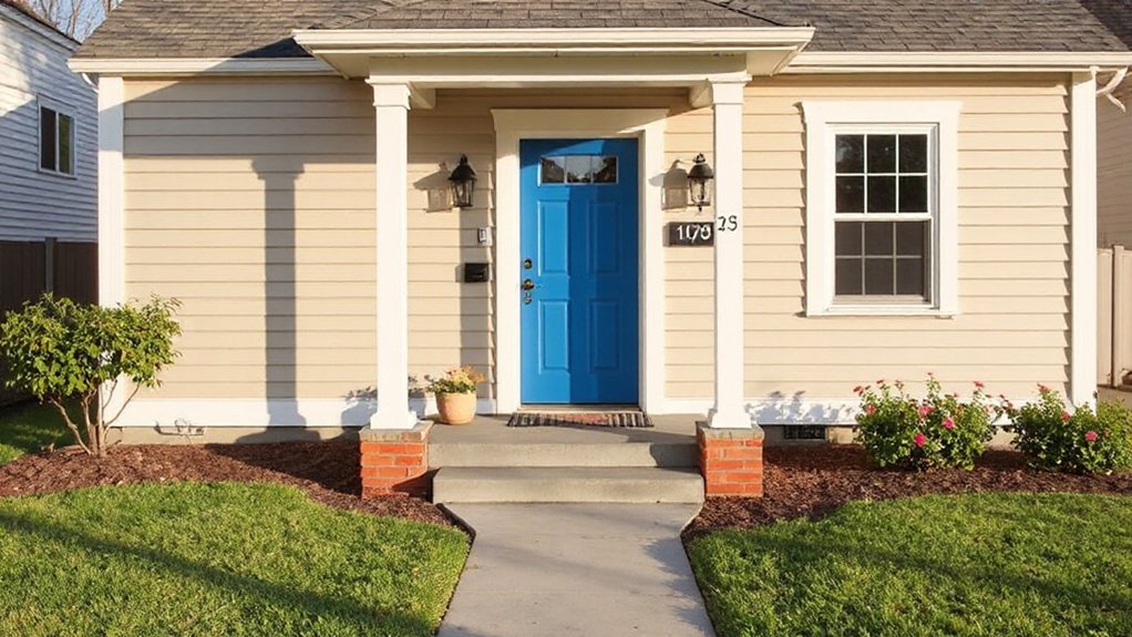
Start with a paint plan that delivers a quick, big impact: choose a bold front door color and trim that pops against your siding.
Pair this with focused landscaping tweaks—fresh mulch, crisp edging, and a few well-placed shrubs—to frame the entry without breaking the bank.
This approach keeps you practical, trend-aware, and precise while you test small changes that noticeably boost curb appeal.
Paint Quick, Big Impact
If you want a noticeable curb appeal lift without breaking the bank, a few strategic paint tweaks can do the job fast. You’ll get big impact by focusing on color psychology and historical influences to guide choices that feel timeless yet fresh.
- Refresh the front door with a bold accent shade to energize entry perception.
- Trim windows and shutters in a crisp contrast to define architectural lines.
- Update the siding hue by swapping to a breathable, durable finish with subtle saturation.
- Add an undercoat primer for even color reads and longer life.
Keep coatings low-luster to reduce glare, and test color pairs at multiple times of day. Practical, trend-aware, budget-smart, you’ll see curb appeal rise quickly.
Focused Landscaping Tweaks
Small, deliberate changes in your landscaping can dramatically boost first impressions without breaking the bank. Focused landscaping tweaks are about precision, not overhaul, so you get noticeable impact with minimal effort.
Begin with garden pathways that guide visitors—from the curb to your door—with clear edges, even lighting, and drought-tolerant groundcovers beneath. A defined path reduces visual clutter and signals care.
Add outdoor lighting along the route: warm, low glare fixtures that highlight steps, walls, and focal trees, creating safety and mood after dusk. Limit plantings to a cohesive palette; repeat colors across borders for continuity.
Mulch, edging, and tidy pruning finish the look, preventing stray growth from overpowering the facade. Small updates here amplify your home’s exterior paint choices and curb appeal.
Real-World Street-Ready Color Palettes You Can Borrow
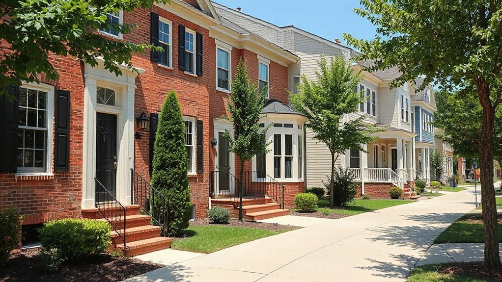
Real-world, street-ready color palettes aren’t about chasing trends so much as choosing combinations that wear well under varying lighting and weather. You can borrow proven pairings from homes nearby that endure sun, rain, and seasonal shifts without screaming for repainting.
- Soft olive with creamy trim for warmth and versatility.
- Slate blue body with white-washed accents for crisp contrast.
- Sage green doors paired with charcoal shutters for modern depth.
- Taupe base with black detailing and vintage accents for timeless curb appeal.
These options are practical, trend-aware, and durable, so you won’t fight with fading or mismatched lighting.
Consider Vintage accents to nod to nostalgia, and Eco friendly paints to keep your project green without sacrificing finish. Keep notes on how each combo reads at different times of day.
Where to Test Colors and When to Seek Professional Help
Picking the right color starts with testing in real conditions, since lighting, texture, and climate drastically shift how a shade reads on your home. Start outdoors with large swatches on several exterior surfaces, and observe at different times of day.
Use full-board tests to gauge color psychology in context—how a hue interacts with brick, siding, or stone, and how it affects perceived warmth or coolness. For accuracy, photograph daily light changes and compare indoors and out.
When testing, consider paint application: brush, roller, or spray will alter texture and finish, so run a small, representative sample with your chosen method.
If you’re unsure after initial testing, seek professional help to confirm color choices, coordination across trims, and long-term maintenance.
Frequently Asked Questions
How Do Exterior Colors Affect Home Resale Value?
You’ll see resale value modestly influenced by exterior colors; choose hues aligned with color psychology and cultural color meanings to appeal broadly, avoid extremes, and coordinate with materials, neighbors, and trends for a practical, value-boosting result.
What Colors Hide Dirt and Wear Best?
You’ll cloak dirt with bold grays and deep olives, where Dirt camouflage hides grime and Wear resistance lasts. You keep surfaces cleaner, choosing matte textures and subtle undertones, staying practical, trend-aware, and detail-oriented as colors endure wear.
How to Test Color Samples Outdoors Effectively?
You should perform color testing outdoors with deliberate sample application, evaluating under full sun, shade, and evening light. Observe fading, texture, and dirt visibility; rotate samples between siding and trim, then compare finishes, sheen, and alignment with surrounding elements.
Which Palettes Suit Different Architectural Styles?
Architectural harmony guides palette choices for different styles, so you tailor tones to your façade while honoring Historical accuracy. You’ll combine period-appropriate neutrals with accent colors, balancing contrast and texture for practical, trend-aware curb appeal.
Can Local HOA Rules Restrict Exterior Colors?
Yes, your HOA can restrict exterior color choices. You’ll navigate HOA color restrictions and exterior color regulations by reviewing guidelines, obtaining approvals, and choosing compliant palettes that still reflect your style while meeting community standards.
Conclusion
Curb appeal lives in contrasts: bold doors against quiet palettes, textures that hum softly beside glossy trim. You’ll gain confidence when color anchors, then recedes—never shouting, always inviting. Weigh durability against drama, sunlit to shadowed hours, brick against siding, matte against gloss. You’ll save money by testing small swatches before you commit, and you’ll sleep easier knowing your plan fits climate and budget. Finally, balance trendiness with timelessness, and let your home quietly stand out, not shout out.