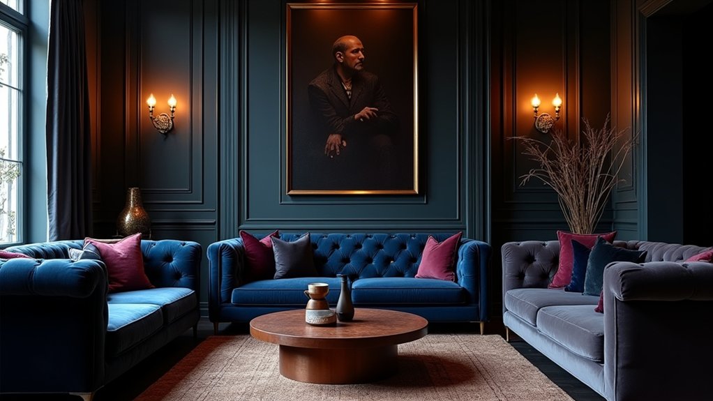
Did you know that deep colors can actually make architectural details pop by absorbing light and creating natural shadows you won’t get with neutrals? You’ll master how to balance drama with warmth, texture, and light to keep spaces intimate rather than oppressive. If you want guidance on choosing palettes, testing shades in daylight, and layering materials without dulling the mood, there’s a precise approach you can apply—and it starts with understanding intensity.
Why Moody Colors Feel Luxurious in Interiors
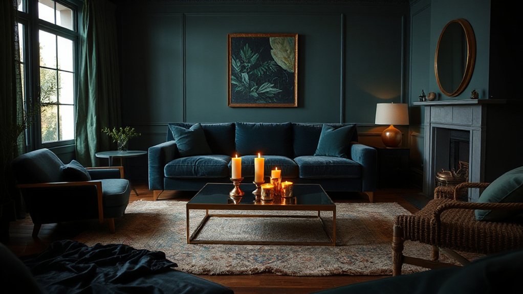
Moody colors feel luxurious in interiors because they deepen the room’s atmosphere with rich, saturated hues that absorb light in a flattering way. You leverage color psychology to craft mood, selecting tones that evoke calm, confidence, or drama.
Deep chroma can frame architectural features, guiding eye movement and perception of space without overwhelming it. Informed choices reflect historical influences, with heritage palettes drawing from Victorian velvet, Art Deco lacquer, and mid‑century lacquered surfaces to create timeless sophistication.
You balance saturation with material texture, letting velvet, timber, and brass add tactile contrast that enhances perceived richness. Consider undertones and lighting as critical levers; they shift color behavior and ambiance throughout the day.
Precision in pairing reds, greens, blues, or neutrals yields luxurious cohesion rather than discord.
How to Balance Drama With Warmth via Textures and Lighting
Textures and lighting are the key levers for tempering drama with warmth. You balance bold surfaces with tactile, inviting textures that introduce softness without sacrificing sophistication. Seek textural contrast: pair a plush velvet with a smooth, matte wall surface, or combine a woven rug against polished timber. This contrast keeps the mood intimate rather than oppressive.
For lighting, opt for ambient lighting that glows softly across scenes, avoiding harsh overheads. Layer sources—near-surface sconces, table lamps, and candles—to create depth and warmth that midtone colours can’t achieve alone. Use dimmers to modulate intensity as evenings unfold, preserving drama while inviting familiarity.
Choose warm white hues, ensuring shadows remain flattering. Precision in texture and glow sustains depth without sacrificing approachability.
Moody Palettes by Room: Living Room, Bedroom, Dining Space
With the groundwork of balancing drama and warmth established, you’ll apply moody palettes room by room to maximize atmosphere without sacrificing comfort.
In the living room, lean on Color psychology to pair deep charcoals with soft neutrals, creating a serene yet grounded space; use architectural features and historical influences as anchors for hue choices.
In the bedroom, favor restrained tints—plums, slate blues, and forest greens—paired with warm metals to foster restful, cocooning vibes while still feeling regal.
The dining space benefits from dramatic contrast: a rich wall color balanced by lighter tabletops and strategic lighting, nodding to historical influences in classical interiors.
Always align palette shifts with room function, ensuring cohesion across progressions.
Pair Deep Hues With Natural Tones and Metallic Accents
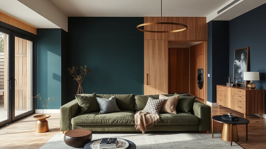
Pair deep hues with natural tones to soften their intensity while preserving drama, creating a balanced moody scheme you can live with. Introduce metallic accents as focal points or subtle support, letting brushed brass, copper, or aged nickel catch the eye without competing with the depth.
This approach aligns Deep Hues with Natural Tones and Metallic Accents, forming a cohesive Moody Color Strategy that feels intentional and refined.
Deep Hues, Natural Tones
When you mix deep hues with natural tones and metallic accents, the result is a grounded, sophisticated palette that feels both intimate and versatile. Pairing midnight or forest tones with warm woods and stone textures creates visual depth while maintaining calm, breathable spaces.
Use natural materials—linens, wool, unpolished marble—to anchor the scene, letting the pigments breathe without overload. Color psychology informs your choices: cooler blues modulate intensity, while earthy greens invite tranquility; yet the overall mood remains intimate when contrasts are restrained.
Cultural influences shape how light interacts with surface finishes, so consider regional finishes and traditional motifs to honor provenance. Keep metallics selective: brass or brushed nickel as subtle punctuation prevents distraction and preserves cohesion.
The result communicates confidence, clarity, and nuanced taste.
Metallic Accents Pairing
Metallic accents punctuate deep hues and natural tones with purposeful restraint, advancing cohesion rather than distraction. You pair metallic reflections with matte surfaces and natural textures to heighten depth without overstatement. Choose brushed brass, antique gold, or gunmetal as quiet anchors, then let deep colors recede around them for balanced drama.
Textural contrasts become your primary mechanism for visual interest: velvet cushions against linen drapes, a leather chair against a plaster wall, or a concrete tabletop with a satin-finish metal trim. The effect remains sophisticated when metallics read as undertones rather than focal points.
Maintain restraint in scale and repetition, allowing light to play across surfaces. Done thoughtfully, this pairing sharpens contrast while preserving harmony throughout the room.
Moody Color Strategies
Color psychology informs your choices: select hues that evoke the intended mood while maintaining daytime clarity and nighttime coziness.
Pair in layers—a dominant dark wall, lighter woods, and a mid-tone sofafabric—to create depth without heaviness.
Introduce metallic accents sparingly to catch highlights and guide the eye, avoiding chromatic competition.
Historical inspiration grounds your palette; borrow influences from traditional interiors and reinterpret them with modern finishes.
Keep contrast purposeful, and document your decisions to assure timeless cohesion across lighting, fabrics, and art.
Practical Steps to Test and Apply Shade Intensity
To test shade intensity accurately, start with a controlled setup: sample swatches under the room’s actual lighting and on the target walls. You’ll compare swatches at multiple times of day and across adjacent areas to map how color reads in context.
Begin with Color swatch testing on large, labeled samples to mirror wall dimensions, then test edges and centers for subtle shifts. Apply a base coat and allow full curing before final assessment.
Use Shade layering to build depth: start with a lighter underlayer if necessary, then incrementally add depth with transparent coats or diluted tints.
Document results with concise notes and photos, noting luminance, undertone, and saturation changes. Confer with clients or collaborators to confirm intent before committing to a full repaint.
Common Pitfalls and Fixes for Dramatic Spaces
Dramatic spaces can deliver striking surroundings, but they also invite missteps if you don’t anticipate how shade reads in real life. You’ll avoid common pitfalls by testing color saturation in varied lighting and room function before committing to a full mood.
Don’t rely on a single sample; paint large swatches on multiple walls and observe at different times of day. An Accent wall can anchor drama, yet overdoing it risks clutter and fatigue.
Keep balance with lighter trims, appropriate textures, and strategic furniture placement to prevent overpowering the room. Guarantee consistent finish across key surfaces to maintain depth without glare.
Finally, document your palette and revisit it after furnishing changes to preserve cohesion and dramatic impact.
Frequently Asked Questions
How to Avoid Overwhelming a Small Space With Dark Tones?
Yes, you can prevent overwhelm by balancing dark tones with light, reflective surfaces and smart lighting. Use Lighting balance to keep rooms bright, placing wall and accent lights at multiple levels.
Pair deep hues with pale neutrals to create contrast. Choose furniture choices with slim profiles and open legs to avoid heaviness.
Add mirrors or glass, and keep fabrics airy. Let the color act as drama, not a clashing focal point.
Which Color Undertones Read as Moody on Different Screens?
Sure, you’ll find undertones read moody differently by screen, and yes, that’s obvious—until you test them. You’ll see warm taupes skew olive on some panels, while cool greys read blue on others.
Color psychology and lighting techniques mean calibration matters: compare swatches under varied light, color-match across devices, and use neutral ground.
You’ll control mood precisely, not by guesswork, but by consistent testing and targeted, expert adjustments.
Best Ceiling Color to Complement Deep Walls Without Glare?
A soft, matte ceiling in a light neutral or pale gray works best to complement deep walls and reduce glare.
You should consider ceiling paint options that include ultra-flat or eggshell finishes to minimize reflections.
Use reflective surface techniques sparingly—add indirect lighting and matte trims to balance depth.
Avoid stark whites; opt for a warm undertone.
This approach keeps the space cohesive, prevents harsh contrasts, and preserves the dramatic mood you’re aiming for.
How to Integrate Moody Hues With Existing Art Collections?
You should balance color intensity by grouping art with frames that echo the moody hues, while keeping one lighter focal piece to anchor the room.
Balance Balancing color intensity across walls, lighting, and textiles to avoid overwhelming works. Use gallery lighting to enhance texture without glare.
Let Enhancing natural light occur through strategic placement of windows and reflective surfaces.
Curate with restraint, rotate pieces seasonally, and let artwork guide the palette for cohesive, sophisticated interiors.
Can Moody Palettes Affect Room Acoustics and Comfort?
Yes, moody palettes can influence room acoustics and comfort. You’ll notice deeper colors absorb light better visually, which lets you stage softer, textured surfaces that improve sound absorption.
In practice, pair velvety fabrics, upholstered furnishings, and wall textiles with strategic paneling to dampen reflections. These choices heighten mood enhancement while maintaining clarity of dialogue and music.
Conclusion
You’ll feel how moody colors elevate your spaces, adding depth, luxury, and intimate atmospheres. By layering velvet textures, warm lighting, and metallic accents, you’ll achieve balance without dulling drama. Test swatches in natural light, adjust intensity, and pair deep hues with natural tones for cohesion. Avoid overly monochrome walls by introducing tactile materials and varied finishes. Practical steps keep you honest: small patches first, then full-rooms. And yes, resist the urge to paint everything charcoal—trust the gradient, not the monochrome. Vintage iPhone.