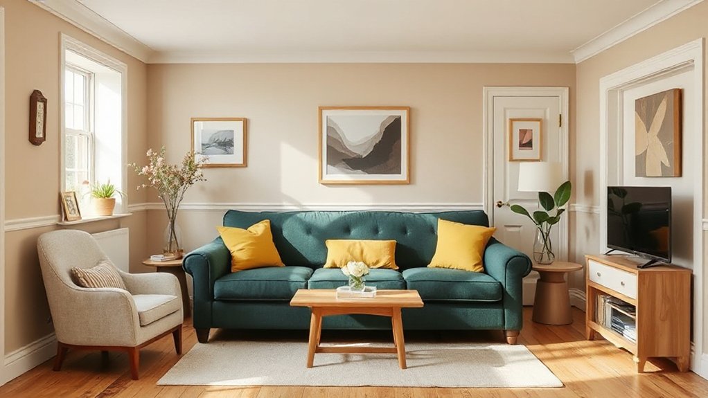
You’ll find UK colour schemes this year lean on warm neutrals, moody accents, and soft pastels, balanced by durable textures and sustainable paints. Start with a calm base of warm whites and beiges, then layer with charcoal or indigo accents for depth. Soft pastels brighten bedrooms, while rich earth tones anchor kitchens. Lighting shifts hues, so test swatches under daylight and artificial light. If you keep exploring, you’ll uncover practical, scalable palettes that adapt to any space.
Identify Your Room’s Palette: UK Colour Trends This Year
To identify your room’s palette, start with a core mood and layer in complementary accents. You’ll map trends to your space by anchoring decisions in practical palettes instead of chasing fads.
Begin with a dominant hue set that aligns with lighting, scale, and usage, then introduce secondary tones to support contrast and depth. Personal colour preferences guide the base, while informed cultural influences shape accent choices, ensuring resonance beyond mere visuals.
Use a controlled, data-informed approach: reference undertones, saturation, and how finishes reflect glass, metal, or textile textures. Test swatches under typical daylight and artificial light to confirm tonal harmony.
Document rationale for each shift—accuracy matters for future refreshes and resale value, maintaining a coherent, timeless environment within evolving UK trends.
Warm Neutrals for Calm Living Rooms
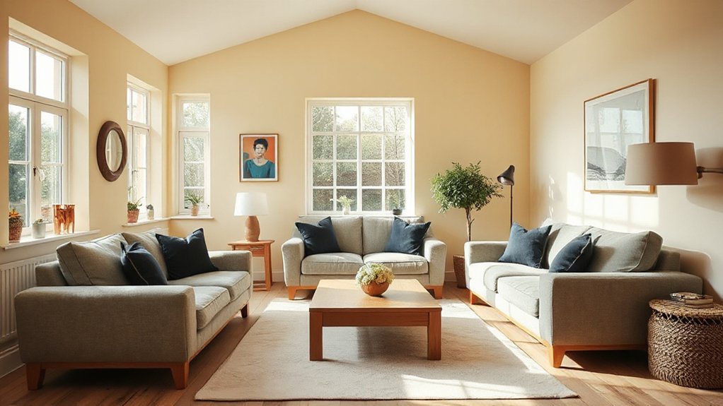
Warm neutrals ground calm living rooms by blending soft beige, taupe, and stone with subtle warmth in lighting and textiles. You’ll notice these hues act as a stable backdrop, enabling legibility for focal art and architectural details.
In practice, color psychology informs selections; cooler whites are avoided in favor of warm undertones that reduce perceived contrast, fostering relaxation.
To maximize impact, align furniture coordination with a restrained palette: matte woods, fabric-covered upholstery in muted tones, and metal accents in brushed brass or antique bronze. This approach supports a cohesive flow from room to room, enhancing perceived space without visual clutter.
Maintain consistency across trims and soft furnishings, and reserve bolder accents for accessories rather than large items. This yields an enduring, versatile core for evolving interiors.
Add Drama With Moody Accents (Without Overwhelm)
Moody accents introduce depth with purpose, adding subtle drama without overpowering the space.
You’ll create balanced depth by pairing rich tones with calm rooms, keeping contrast controlled and cohesive.
This approach keeps rooms feeling polished and trend-aware, not heavy or cluttered.
Moody Accents, Subtle Drama
Dark drama can elevate spaces without overwhelming them: incorporate moody accents through restrained color choices, strategic lighting, and tactile finishes that anchor rather than shout. You’ll achieve depth without clutter by pairing palette with texture, artfully using contrast and rhythm.
- Pair charcoal or Indigo with warm woods to create textile layering that reads as curated, not heavy.
- Use an accent wall sparingly, selecting a matte, low-sheen finish to avoid glare while anchoring the room.
- Layer fabrics—velvet, wool, linen—in complementary tones to cultivate tactile richness without saturation.
- Limit metal accents to burnished brass or gunmetal, letting lighting become the drama rather than color alone.
Balanced Depth, Calm Rooms
You’ll achieve calm through quiet, complementary tones that extend across walls, furniture, and textiles, while accent pockets introduce intensity without crowding perception. Implement color psychology by pairing contemplative blues or charcoals with warm neutrals, ensuring a cohesive narrative throughout zones.
Prioritize low-reflectivity finishes and matte surfaces to reduce glare, enhancing legibility and comfort for extended use. Artistic expression thrives when personal collections and statement pieces are integrated as punctuation rather than dominant themes.
Maintain a clear hierarchy, reserving bold tones for focal anchors and allowing lighter hues to diffuse energy across rooms.
Soft Pastels for Light, Airy Bedrooms
Soft pastels create a light, airy bedroom backdrop by washing walls, ceilings, and trims in restrained hues like blush pink, mint, or pale lilac. You’ll leverage these tones to maximize natural light and perceived space, guided by seasonal colour palettes and colour psychology insights to optimize mood and sleep quality.
The approach prioritizes restrained saturation, clean lines, and harmonious contrasts with whites or soft wood tones.
- Apply soft pastel walls as a canvas, then introduce crisp white trims to sharpen edges and reflect daylight.
- Pair mint with pale lilac accents for calming contrast without overpowering the room.
- Integrate blush pink textiles and cushions to warm the space without dulling luminosity.
- Use muted, cool-toned blinds or curtains to sustain an airy ambience throughout the day.
Rich Earth Tones for Kitchen Warmth
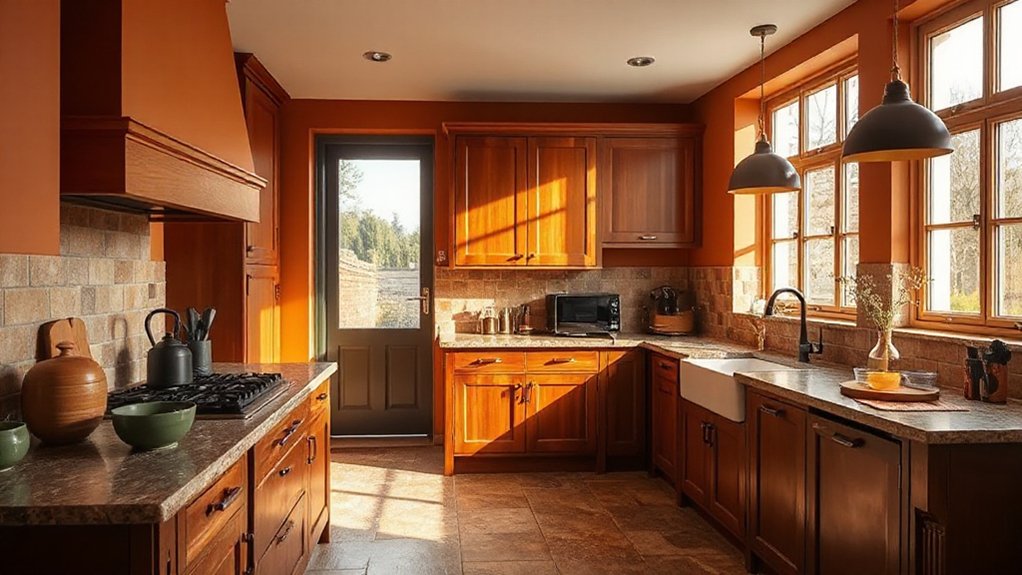
You gain warmth from earth tones that anchor kitchen schemes and elevate everyday tasks into tactile experiences. Think clay-inspired hues and rustic accents that create inviting ambience.
While doing so, these elements remain technically scalable across lighting, cabinetry, and finishes. This trend blends durability with aesthetics, guiding you toward cohesive, trend-aware choices that sustain appeal over seasons.
Warmth From Earth Tones
Earthy, rich tones bring warmth to kitchen spaces by grounding light cabinets and countertops with mineral-inspired pigments; they’re the core of current UK kitchen schemes. You’ll see these hues anchor surfaces, balancing brightness with depth, while maintaining practicality for high-traffic zones.
This approach heightens perceived insulation, supporting energy-aware design without bulkier materials. Incorporate indoor plants and textured fabrics to amplify tactility and airiness, reinforcing an authentic, nature-infused palette.
Expect nuanced shades—terracotta, ochre, olive, and slate—applied in controlled swathes to preserve contrast and legibility in cabinetry, islands, and backsplashes.
- Implement mineral-inspired wall accents to tie cabinetry to countertops.
- Use warm-wood veneers with cool neutrals for balance.
- Integrate indoor plants as focal points on open shelves.
- Choose textured fabrics for seating and window coverings.
Kitchen Ambience With Clay
Clay-toned kitchens fuse warmth with practicality, creating a robust ambiance that anchors light cabinetry and cool surfaces through rich mineral pigments. You’ll notice clay-inspired decor guiding material choices, from terracotta tiles to matte, umber surfaces that reduce glare while enhancing perceived depth.
In practice, you pair clay hues with brushed brass hardware and subtle, daylight-reliable lighting to preserve legibility and tone fidelity. The palette supports durable finishes, so you can opt for stain-resistant laminates or vitreous enamel countertops without compromising warmth.
For layout, implement earthy kitchen accents via open shelving in warm wood tones and ceramic accessories that echo mineral deposits. This approach sustains a timeless, low-sheen aesthetic, ensuring consistency between storage, work zones, and dining zones while staying trend-aware.
Rustic Hue Inspirations
1) Clay-bodied cabinets with matte enamel
2) Walnut, brass, and aged-metal hardware contrasts
3) Glass tiles echoing folk art motifs
4) Textured textiles as accent upholstery
Durable Textures That Elevate Colour
Durable textures are the backbone of color schemes that last beyond trends, because their tactile resilience lets you layer hues without sacrificing integrity. You’ll notice how material weight guides perception: a matte plaster wall anchors bold accents, while a brushed timber panel adds warmth without glare.
Textural contrast becomes a deliberate instrument, shaping rhythm across rooms and subtly steering light. You should select tactile finishes—linen, wool, and micro-sateen—that endure daily use and maintain their character with wear.
Layering becomes strategic rather than decorative, because durability supports repeated palette updates without reconfiguring structural surfaces. Prioritize engineered composites for high-traffic zones, and pair with natural fibers in lounges to maintain balance.
In practice, durable textures translate color intent into lasting, cohesive environments.
Sustainable Pigments and Low-Impact Paint Choices
Sustainable pigments and low-impact paints are reshaping interior colour decisions by prioritising chemistry that minimizes environmental footprint without sacrificing performance. You’ll find formulations that emphasize reduced VOCs, durable binders, and transparent sustainability claims that endure. The result is colours with stable tone, improved hiding power, and superior longevity, aligned with eco friendly pigments and low impact paints.
- You’ll select pigments sourced from responsibly managed minerals and plant-based alternatives, ensuring lower environmental load without dulling clarity.
- You’ll prefer low-VOC or zero-VOC systems that maintain indoor air quality while delivering consistent colour performance.
- You’ll evaluate binder chemistries that optimise adhesion and washability, reducing repaint cycles.
- You’ll prioritise certifications and traceability to guarantee truly eco friendly pigments and low impact paints across the project.
How Lighting Shapes Colour Perception
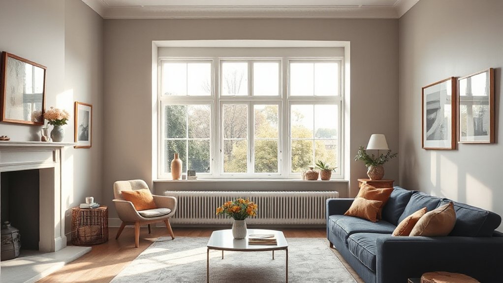
Lighting changes the perceived hue of a surface and can subtly shift color warmth or coolness as you move through a space.
As brightness increases, you’ll notice brighter whites skewing toward blue, while dimmer levels enhance amber and red undertones.
This relationship—how lighting alters hues and overall brightness perception—drives how you finalize palettes across rooms.
Lighting Alters Hues
How you illuminate a space can dramatically shift how its colors read. Lighting alters hues by changing spectral content, intensity, and distribution, so you perceive surfaces differently at various times of day.
You’ll notice natural daylight revealing cooler, truer tones, while artificial lighting can warm or cool the palette depending on source and color temperature.
Precision matters: choose fixtures that balance glare, color rendering, and shadow depth to preserve intent.
- Natural daylight brings dynamic shifts across the day, affecting perceived undertone.
- Artificial lighting with high Color Rendering Index (CRI) preserves fidelity of pigments.
- Tunable white options enable consistent mood without color distortion.
- Layered lighting minimizes perceptual bias, stabilizing hue perception across activities.
Brightness Shifts Perception
Ambient brightness shifts color perception by altering contrast and depth, so the same swatch can read differently under varying luminance levels. You’ll notice that higher ambient light elevates perceived saturation and luminousness, while dimmer settings mute chroma and depth cues.
In practice, perception psychology explains why adjacent walls or furnishings influence how you judge a color’s warmth, coolness, and intensity. Designers calibrate lighting to preserve visual harmony, ensuring that color choices remain consistent across rooms and times of day.
A trend toward diffuse, layered illumination reduces harsh shadows and helps grayscale ramps blend, maintaining accurate hue cues. For your schemes, test swatches under typical floor-to-ceiling luminance ranges, and prioritize lighting that supports stable, breathable color perception rather than transient, glare-prone readings.
Mixing Heritage Charms With Modern Palettes
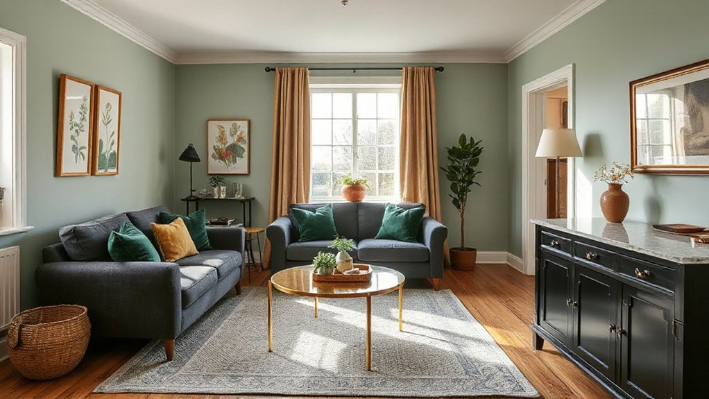
As designers blend history with today’s sensibilities, mixing heritage charms with modern palettes creates spaces that feel both curated and fresh. You’ll leverage contrast to anchor contemporary geometry with classic detailing, ensuring each element speaks a shared language. Focused palette frameworks guide integration, preventing overwhelm while celebrating lineage.
Emphasize texture hierarchy—metals, timber, and ceramic respond to purposeful lighting, elevating the room’s rhythm. Heritage restoration informs scale and proportion, preserving authenticity while enabling soft inclusions of current finishes. Vintage furniture acts as a tactile bridge, pairing patina with clean lines to achieve timeless appeal.
You’ll synchronize chroma saturation with architectural cues, yielding cohesive, dynamic interiors that endure.
- Heritage restoration as a guiding constraint
- Vintage furniture as texture anchors
- Timbral contrasts between matte and gloss
- Proportional dialogue across periods
Country House Vibes in Urban Homes
Country house vibes are translating into compact urban footprints by embracing warm, rural textures and practical scale, then pairing them with urban-ready finishes and efficient layouts. You’ll notice material honesty drives permeability between interiors and exteriors, with timber floors, plaster walls, and linen-weave textiles that soften edges without sacrificing durability.
A restrained palette anchors spaces while allowing tactile contrast; think stone or clay tones balanced by soft greens or muted blues. To maintain city-scale practicality, storage is integrated into architectural lines, avoiding visual clutter.
Garden integration becomes a functional feature rather than a decorative afterthought, including planters that rise with seating zones and overlooks. Outdoor colour palettes extend indoor schemes, ensuring seamless continuity across thresholds and reinforcing a cohesive, era-respecting yet contemporary home.
Quick Start: Implementing Your Colour Scheme Now
You’ve got a grounded palette from the country-house vibe, now it’s time to put it to work in your space. Implement quickly by aligning surfaces, lighting, and texture with evidence-based choices. Focus on color psychology to govern mood shifts: warmer tones for inviting areas, cooler shades for concentration zones, and accent hues to guide flow.
Guarantee paint durability by selecting surfaces with proper prep, high-quality primers, and finish types suited to traffic and washability. Plan a two-step rollout to avoid rework, and document color codes for consistency across rooms.
- Prep thoroughly: clean, sand, prime, and patch imperfections.
- Test swatches in multiple lighting moments to verify perception.
- Choose durable finishes (eggshell/matte) for walls, satin for trims.
- Create a cohesive accent strategy that reinforces the mood.
Frequently Asked Questions
How Can I Test Color Before Committing to a Room?
Yes—start with color testing techniques: sample paints on large test areas, use home decor samples next to lighting, and observe at different times. You’ll compare undertones, then finalize your palette confidently before committing to the room.
Which Wall Should Be Accent and Which Keep Neutral?
In most rooms, put the accent wall on the wall you face first, keeping the others neutral for balance. For example, halo a bold accent behind your sofa; use neutral palette tips elsewhere. Accent wall ideas guide, stay balanced.
Do Paint Wishes Affect Resale Value or Appraisal?
Yes, your paint choices can affect resale value and appraisal, especially if you choose colors aligned with color psychology and paint durability. You’ll see stronger market appeal when finishes meet durability expectations and psychologically favorable tones guide buyers.
How Many Colors Are Appropriate for a Small Space?
Color-cautious, you should choose two to four colors for a small space. You’ll maximize mood with color psychology, and pick paint finishes that reflect light and texture. Maintain clarity, consistency, and contrast to keep the area feeling expansive.
Can Color Schemes Influence Mood Across Different Rooms?
Yes, color schemes influence mood across rooms. Color psychology guides choices for mood enhancement, aligning hues with activities and rhythms; you’ll notice calmer bedrooms, energetic kitchens, and focused workspaces as you tailor palettes to function and feel.
Conclusion
You’ve seen the spectrum’s shifting sway across UK homes. Start smart: select a main mood, then layer with light, lift with lively accents, and lean into lighting to shape perception. Pair warm neutrals with moody hues for contrast, soften with pastels in bedrooms, and ground kitchens in rich earth tones. Mix heritage charm with contemporary palettes to keep spaces timeless. Implement quickly: test swatches, map room roles, and iterate until your interiors feel unmistakably you.